One super-quick card and one which should have been quick, but….
I am running a bit low on general birthday cards, so wanted to rustle up a few quick ones. And, if I can fool people into thinking they took ages, so much the better. I know you can’t fool a crafter, but most people I know would struggle to define ‘double sided tape’ and would think a bone folder would most likely be an implement of torture or medieval medicine, probably to be used alongside some leeches. So, with a bit of smoke and mirrors I might get away with it.
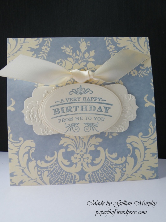
Super-quick one first. This is Anna Griffin cardstock, already cut to size. I matched the cream colour in the pattern as best I could from my stash and the blue from my inks. I used a Tattered Lace Charisma Frames 1 die, which I ran through an Anna Griffin embossing folder, stamped the sentiment onto the same cream card and cut out with a Spellbinders oval. Some 3d foam and a ribbon flourish to finish. Done in minutes.
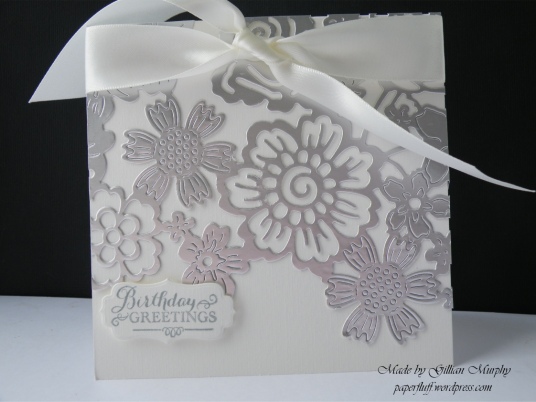
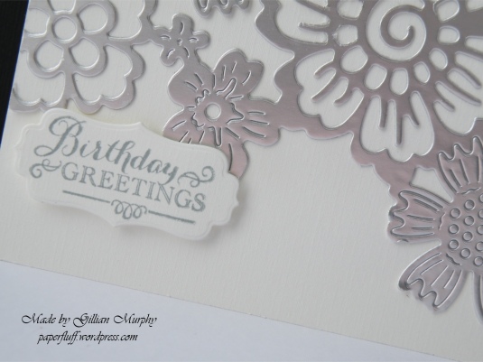
Now for the one I had to rugby tackle into submission. The only reason it was a bit trickier was getting a good cut on the die. This is a large floral panel from Tattered Lace (I have lost the packaging so cannot tell you the name). Using my Big Shot and with all the tabs on the Universal Platform closed, it felt just too tight to get it through the machine safely. But running it through with one tab open was no good either as it just didn’t cut at all. I ended up with a sort of princess and the pea pile of card underneath the die and cutting plates to act like a booster seat. I had to run it through the machine many, many times, shim certain spots and even then, when it looked ok I realised it hadn’t cut everywhere so ended up attacking it with the craft knife to finish it off. As in, complete it, not hack it to bits in a fit of pique. Although it did cross my mind.
Once cut to satisfaction, it is just a case of trimming round where the flowers join to get the line you want at the bottom. Leave the rest intact until you stick it on to your base card, overlapping the sides and top. Then trim. The stamped greeting is Anna Griffin again, and the die is the same set of Charisma Frames used for the first card. I chose an off-white shade for the card base as pure white looked a little too harsh, and because I have an enormous roll of ivory ribbon!
I see duck feet in the petals of the flower on the right, no?

These are so classy and sophisticated Gillian! The Anna Griffin paper is gorgeous and I really like the embossing under the sentiment. The die you used on the second card is just so pretty and I think that this card design would make a beautiful wedding invitation. The ribbon finishes them off perfectly 🙂
LikeLiked by 1 person
Thanks. I agree it would be good for a wedding, but given my struggle with the cutting it would have to be for a guest list of about two people!
LikeLiked by 1 person
P.S… definitely see duck’s feet too!
LikeLiked by 1 person
WOW!! These cards are going to go down a treat!! 🙂 Stunning!
Yep, certainly can see a few ducks heading your way. 😉
LikeLiked by 1 person
Thanks! I’d love a houseful of ducks. Sadly probably not practical though!
LikeLiked by 1 person
Bit on the messy side where your floors would be concerned. 😉 The ducklings would be super dooper cute on the plus side
LikeLiked by 1 person
Love them both, Gillian! QUACK!
LikeLiked by 1 person
Thanks Kathy. Another vote for the ducks, then!
LikeLiked by 1 person
Gorgeous cards. Very elegant and stylish. I can see duck feet but only because you pointed them out! lol!
Flo x
LikeLiked by 1 person
Thanks Flo. You are very kind!
LikeLiked by 1 person
It does look a bit like duck feet!
Both card are gorgeous, but I think I like the second most. Sounds like it was very frustrating to make though. Good on you for persevering!
LikeLiked by 1 person
Doesn’t it? I need to think what I can do with duck feet! Second card was my favourite too.
LikeLiked by 1 person
Very classy cards! Beautiful work, the effort with the die was well worth it. I see duck feet too. 😊
LikeLiked by 1 person
Thanks. Glad to know I’m not going quackers! (sorry, couldn’t help myself!)
LikeLiked by 1 person
Such pretty cards! The first one reminds me of Wedgewood pottery.
LikeLike
Thanks so much! And yes, definitely Wedgewood colours.
LikeLiked by 1 person
Both of them are breath-takingly beautiful. If bullied into choosing just one I think I’d go with the first one – simply because of the colours. But the second card has a certain charm and simplicity which makes it stand out.
Oh … the ducks feet… yes I saw those too. LOL.
LikeLiked by 1 person
Wow, such kind words. Thank you. The ducks also thank you for their recognition!
LikeLiked by 1 person
LOL .. and what’s worrying me is ….I can hear them from here!
LikeLiked by 1 person