I so wanted to title this with the ‘it looks like reindeer’ pun, but I figure I have trampled over the line of acceptable punning way too far already on this blog, so I resisted. Practically killed me.
I don’t know where all my Christmas stamps are – I have a suspicion in a box at the bottom of a pile of other very large boxes, which means they will probably stay there unless I find an extra few days somewhere to sort out the craft room. I have a few stragglers lurking around though, and this stamp is one of them. I don’t think I used it much when I bought it years ago, back in the day when this one stamp cost £9.95!! Time to give it a quick workout.
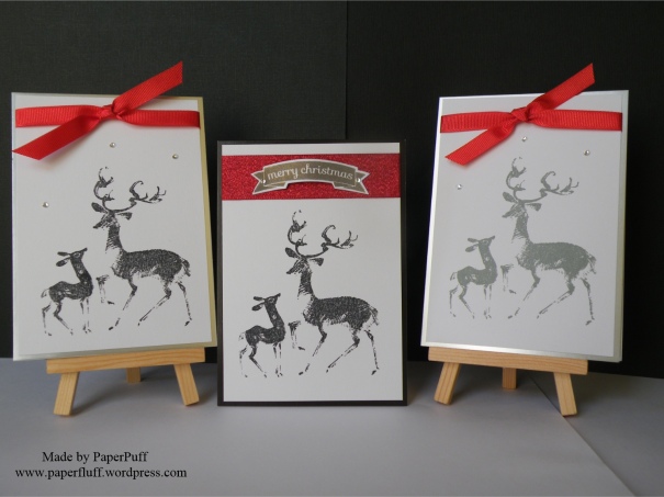
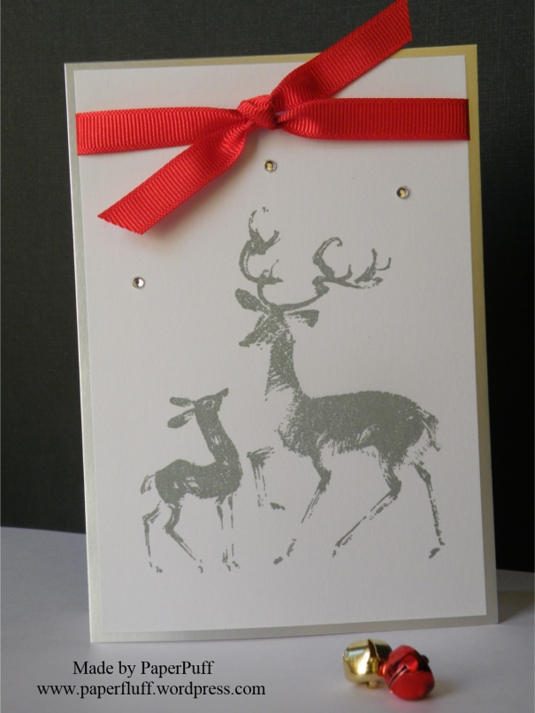
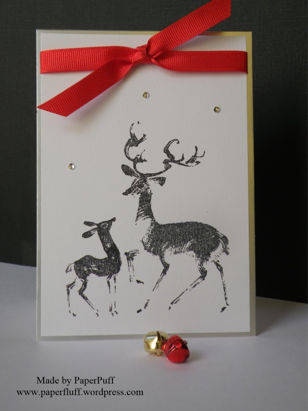
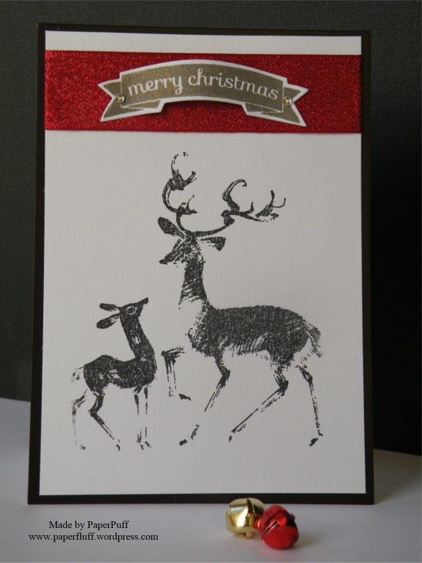
So more reindeer themed cards then. I have a trio here, all very slightly different, because some things worked and some did not. Firstly I wanted to stamp this in grey, to be softer than black, but the grey ink didn’t do the best justice to the stamp’s detail. So I also tried it in two different blacks, which both showed the detail fine but were a fraction harsher than I would have liked, and totally indistinguishable from each other. Never mind, they are still usable.
I then decided I would ‘explore the theme‘. Translates as ‘mat them on to different colours and see which flies best‘.
Card number one is the grey ink, on a silver base card
Card number two is black ink, on a silver base card
Card number three is black ink, on a black base. This one definitely did not look very Christmassy with just the knot of red ribbon the others are sporting, so I went for a bit of extra sparkle (glitter ribbon – who knew that existed??) and a sentiment. I also ‘domed’ the sentiment a little bit and supported it in the centre with some 3d foam so it would not get squished. I swear, if 3d foam suddenly becomes unavailable I may need to question my very existence.
What do we think? Which one looks the best? And, did you spot the ‘props’? OK, so it was two jingle bells, but it’s a start… Oh, and Kathy at paper and ink imaginings, three dotted gems – thanks for the suggestion last time!
The stamp is Penny Black “Let’s Play”. I have googled and it still seems to be available here and there. The banner greeting is from Clearly Besotted Mini Banners and ribbon from The Ribbon Room.

Oh thanks for making me laugh…
I like the first one the best! I love the grey ink! I have different colors but always stamp in black…might wanna try a different color sometime too! Thank you for the inspiration!
LikeLiked by 1 person
Thanks! I like the grey best – softer. Greys are good if you can get decent ones. This is Lawn Fawn Hippo.
LikeLiked by 1 person
That’s a lovely stamp – having trouble picking a favourite out of the three though. At a push – a big one – I might be inclined to choose the grey ink on silver background. I don’t know why, I just like the grey, but then again the black ink is very striking against the red ribbon… I’ll get back to you on that one!…. By the way, how’s the knitting going? 🙂
LikeLiked by 1 person
I think the grey is still my favourite too, even though it is a bit less clear on the stamping. Might need a Versafine ink pad maybe. Hmmn, the knitting. Well, I have plenty of plans! Nothing finished, but plenty of plans!
LikeLiked by 1 person
I definitely like the last one best; it’s somehow very formal and ritzy. And your props are perfect! 🙂
LikeLiked by 1 person
Ooh I am liking ‘ritzy’! I couldn’t decide between one and three, then plumped for one because of the grey, but actually now you have made me think… I could ritzy up version three a bit more…
LikeLike
While you ritzy up version three, please listen to this, which is now going to be stuck in my head the rest of the day (my own fault): https://youtu.be/OG3PnQ3tgzY
LikeLiked by 1 person
I hadn’t heard that version before. The 1980s were truly a decade like no other!
LikeLiked by 1 person
All three are lovely and I can’t pick a favourite as – although they’re all stamped with the same image, they’re actually all different.
The one which has the red glitter ribbon .. the sentiment looks to be glittered or on a more old gold coloured card – so it did cross my mind that maybe Rudolph and his child might look rather fetching stamped in brown ink. It might also be a nod to nature and the colour of their coats. . . . (but it was just a thought from my one brain cell)
Fabulous cards though, Puff. Very elegantemalised ~ Cobs. x
LikeLiked by 1 person
The one you are talking bout – it is Brilliance Lightening Black ink on plain white card. Found it, unopened, in my inks tray! It is black but with a lot of gold in it – interesting! I did I think do them in more ‘natural’ colours years ago, but this year I am on ‘mission silver’, hence trying the grey. I nearly gave one of them a red nose but decided against it!
LikeLiked by 1 person
good decision making, Puff. You’ve just earned yourself a silver star on your chart!
LikeLiked by 1 person
Shucks!
LikeLike
What a pretty stamp, Gillian! And, YES, I see your jewel snow! 😉 I cannot pick a favorite between the 3 cards – they are equally lovely. I agree with Cobs, if you are so inclined to stamp the deer pair again, try brown ink.
LikeLiked by 1 person
I think I did them in brown many eons ago, but because I am trying to utilise my mountain of silver card I went a different route this time!
LikeLiked by 1 person
I totally understand using the mountain of cardstock! How about embossing them in silver to match?
LikeLiked by 1 person
Nice idea, but the stamp detail means it doesn’t emboss well. Bit blurry, like you need reading glasses to see it:-)
LikeLiked by 1 person
Right…I didn’t think about that! Alas, I was just trying to help you get through your silver cardstock!
LikeLiked by 1 person
I know – I appreciate the thought!!
LikeLiked by 1 person
First of all, I love a punny title… I have to work hard with the titles otherwise i just end up with ‘card share this, card share that!’ Puns get you noticed 😜…secondly and more important, these cards are beautiful… I love the grey on silver, very sophisticated 🤓 Keep the puns coming, you posts make me smile 💕😘
LikeLiked by 1 person
Thanks so much! The grey and silver is definitely the most popular so far, and mine too I think. Normal punning will be resumed soon, I am sure!
LikeLike
My favorites are one and three and the jingle bells too 🙂
LikeLiked by 1 person
Thanks! I do love a jingle bell!
LikeLike
I like them all, but the grey ink is more subtle so I think that’s my favourite. However, you can’t have too much glitter ribbon, especially at Christmas.
LikeLiked by 1 person
Thanks! The grey version definitely has more votes! I might try the glitter ribbon with it too, just in case…
LikeLike
A rodeo of reindeer… the grey ink is very elegant and deer are very ‘in’ – what a lovely set of cards 🙂 I don’t even want to think about Christmas – my Xmas spirit is hiding in the bottom of the wardrobe gibbering in fear…
LikeLiked by 1 person
I know what you mean, but if you make stuff for Christmas you just have to start early, or survive November and December on no sleep! I suggest you try enticing your Christmas spirit out with a treat…maybe a candy cane??!
LikeLiked by 1 person
Just don’t suggest eggnog…!
LikeLiked by 1 person
Never had it, but it never sounds enticing. I’d stay put for sure!
LikeLiked by 1 person
Lol…alcoholic custard would be enough to terrify the bravest of festive elves…
LikeLiked by 1 person
Eew! How big is the wardrobe? I feel some Christmas queasy coming on…
LikeLiked by 1 person
You could probably fit in too…but bring biscuits…and perhaps those handy little paper bags…
LikeLiked by 1 person
Ok. And a torch. And some books. Curried beans if I can find them, given your bean shortage,…some knitting, and my die cutter, the ironing….the cat…more ironing…
LikeLike
And the kettle! Can’t forget that…what about teabags? I drink Yorkshire but would be prepared to compromise at Typhoo..
LikeLiked by 1 person
I thought for a moment that said you drink FOR Yorkshire. then I though ‘I didn’t know tea-drinking was a sport. Kinder than shin-kicking though’. Then my eyeballs sorted out the confusion.
LikeLiked by 1 person
Ha ha ha! Drinking tea even as I type…although the amount I drink (of tea that is) I probably could represent the county…!
LikeLiked by 1 person
We could make you a sash, to go with the tabard….
LikeLiked by 1 person
“CHAMPION YORKSHIRE TEA DRINKER-IT’S CHAMPION”
Sorry…feeling a bit shouty…
LikeLiked by 1 person
S’Ok. You are right to feel passionate about your achievement. Two regalia of office in one year?!
LikeLiked by 1 person
THANK YOU!!
Horrible day…still feel shouty…must drink more tea…
LikeLiked by 1 person
Oh dear. Hope some inner peace pops up soon! If not, keep shouting. What the heck….
LikeLiked by 1 person
Got headache now actually…think I might stop shouting for a bit…
LikeLiked by 1 person
…and….breathe….
LikeLiked by 1 person
Better now…thank you…:)
LikeLiked by 1 person
I like them all! I couldn’t pick just one 🙂 I do love the cards and the reindeer!
LikeLiked by 1 person
Thanks so much! I would make reindeer cards all year round if I could – they are a favourite for me!
LikeLiked by 1 person
🙂
LikeLiked by 1 person
A lovely trio of cards, the stamp is really cute! You’re right about the black ink, it does show the detail better and I love the simplicity of the red knot. I kinda think that the red knot might look nice with the reindeer in black against a black base but you said that didn’t look particularly christmas-y….I guess sometimes I just quite like Christmas cards that aren’t particularly christmas-y, more like general winter cards. That’s just my taste though!
LikeLiked by 1 person
I like each one-but the last one is my favorite! I just love the stamp!
LikeLiked by 1 person
Ah, yes, of course, I can see why the stamp would appeal to you!
LikeLiked by 1 person
The last one is the winner. That glitter ribbon makes such an impact. Of course I love all things glittery, but the width of it is what makes the card.
LikeLiked by 1 person
Thanks! Maths brain again?! The ribbon is pretty cool…
LikeLiked by 1 person
I didn’t think of it that way. Yes, it really is about scale and maths!
LikeLiked by 1 person
You make this so hard!! I love each one of these cards.
Also I have no idea how much 9.95 (with that funny squiggly L thing in front) comes to in US dollars and that makes me very curious how much the stamp actually was :). –your ignorant American friend. (the Chicken Grandma)
LikeLiked by 1 person
I will not accept you calling yourself ignorant!! You are a deep thinker and a great illustrator with words. Anyway, its about USD 12.50 at current exchange rates, but I bought it years ago, so factor in inflation etc (I don’t know how to do that, by the way!) and yep, it felt like quite a lot of money at the time for one stamp!
LikeLiked by 1 person
I am pretty sure I have categories where I am ignorant….but I have a great love of learning!
LikeLiked by 1 person
I know a lot of people say this, but sometimes I do completely agree that school is wasted on the young! I’d love to go back to lessons now!
LikeLiked by 1 person
You are so right!! We have a community college in this area that sometimes holds classes for the “non-traditional” student….which I translate to the old student :). I always check the brochure to see if there is a class I need to take.
LikeLiked by 1 person
Out of interest (or nosiness), what would you like to study? Practical skills or a subject or language?
LikeLiked by 1 person
I would love to learn a different language. In high school they offered German – which I took for 2 years. I only remember a few phrases. Spanish would be good. I also think skills like basket weaving would be fun! A blogging class would be good so I would know what all those buttons were good for before I go ahead and click on them!
LikeLiked by 1 person
Good call – I would definitely join a blogging class too! Actually I like all of your choices. Couldn’t get along with German at school but I would love to try learning Spanish. I only know how to order two beers and say thank you. If nobody wants a beer I am useless!
LikeLiked by 1 person
What a gorgeous stamp and the cards are fab’. My favourite is the most faded looking one, just a hint of colour and a bold banner.
LikeLiked by 1 person
Thanks Barbara. It’s funny how you find something you have had for ages and suddenly fall in love with it again!
LikeLike
Love them all. Wonderful modern feel to the design. Great stamp. Stamped in grey it could almost be a sketch.
Flo x
LikeLiked by 1 person
Thanks Flo! It is a lovely stamp – don’t know why I haven’t used it more really!
LikeLike
I think they are all lovely, but I think my favourite is the grey syamped one. It mught have slightly less detail but its so soft a dreamy and lovely!
LikeLiked by 1 person
Thanks! The grey definitely seems to be the most popular. I guess that means I should stick with my instinct!
LikeLiked by 1 person
I’ll go with the grey too!
LikeLiked by 1 person
I think the grey wins by a nose!!
LikeLiked by 1 person
These are gorgeous. I love how ‘clean’ they all look. I think both the grey and black versions look nice.
LikeLiked by 1 person
Thank you so much! I can’t resist the chance to make a reindeer card!
LikeLiked by 1 person
My favourite is the middle one, drawn by the red glitter strip and I loved the banner touch! Beautiful! x
LikeLiked by 1 person
Thanks Kim. The glitter ribbon is rather super, and another bargain find!
LikeLiked by 1 person
Oh I think my favorite is the last one….Love the black mat with the red glitter ribbon. I love how you popped up the sentiment and added the gems to give it the appearance that they are holding the sentiment on. All three are cute! 🙂
LikeLiked by 1 person
Thanks, Nancee!
LikeLiked by 1 person
“…if 3d foam suddenly becomes unavailable I may need to question my very existence.” Same here! 😄
LikeLiked by 1 person