Colouring has always given me problems. Both physically, as I am of partly Irish heritage so, basically almost see-through pale and red hair. Prone to ‘lobster’ within about five minutes of full-on British sunshine, which, let‘s face it, on a sunshine scale is still in the ‘could try harder’ range.
Also, craftily. I cannot colour. Helpful TV or YouTube demonstrators say things like ‘just decide where the sun would be, and therefore where the shadow is and you can’t go wrong’. Poppycock. I am aware of the sun (see aforementioned personal issues with the golden orb) and have managed to grasp the tricky concept of shadows since childhood (Peter Pan was a big help with the science bit).
But the demonstrators don’t tell you what to do after that!! Just because I know where the sun is, does NOT mean I know where ALL the shadow should be! And how do I make a shadow anyway? I try just adding a smidgen of a darker shade, or two, and attempting to blend it in a bit, but I still can see it is not good enough, not ‘right’. And when do you stop? When is it finished? How do you know? I have heard people say ‘it will be obvious when you are finished’. Never has been to me. Does that mean I should continue until the paper literally falls apart with the amount of alcohol marker I have slathered it with? Will it be done then?!
Is colouring an ability you either have – like perfect pitch – or you don’t? Was I not in the right queue at the gene pool? Was I still changing into my swimming costume? Or reading the warning notice and wondering what on earth ‘bombing’ was? Or eyeing up the lifeguard? Or did I just see a notice that said ‘do you want chocolate’ and got distracted? Then in the meantime all the colouring genes were handed out, the counter closed and I was left with ‘you will always find comfort in cocoa beans’ as my gift??
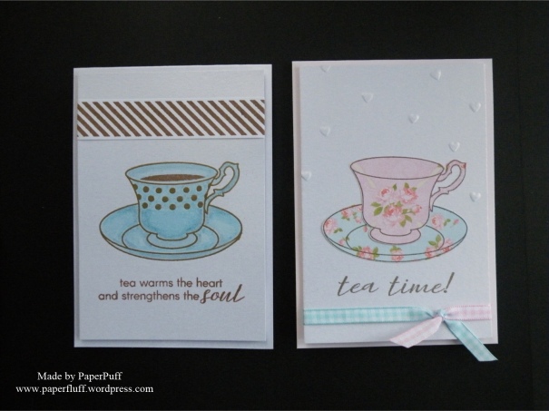
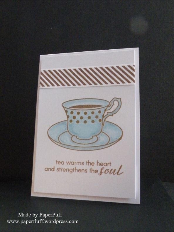
So, this first card graphically demonstrates another failed attempt at colouring. I thought I would be strategic and use pearl card, as I hoped the markers would glide and blend more easily. Sadly it still looks like someone did it with a cheap felt-tip pen that was gasping its last. Having spent some time stamping and embossing the cup, saucer and spotty decorative detail I felt demoralised. Even more so when the marker smudged some of the embossing a bit too. I didn’t think that was supposed to happen. I thought that was against the law. But hence all the circling around the embossed dots, rather than gliding over them seamlessly. And I honestly laid down SO MUCH colour, went over and over with the pens but still have ugly lines and blotches. Phooey.
After that, I licked my wounds (and a couple of bite size Snickers left over from Christmas) and went back to using colour in a way that works for me. Paper piecing. Stamp it, cut it out, layer it up. Emboss a scattering of random hearts too. Some inner calm was restored, but not enough for me to be able to decide on pink gingham ribbon, or blue gingham ribbon? Therefore, like the witches in Sleeping Beauty, I ended up with both.
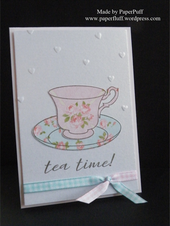
Supplies: Altenew Vintage Teacup stamps and Wam Grays ink cubes; Clearly Besotted Diagonal Stripe stamps; Crafter’s Companion Centura Pearl card; Papermania Blueberry Hill paper pad (old); Create and Craft gingham ribbon

I LOVE these cards! Excellent artwork, design and sentiments 🙂 🙂 Tea anytime or anywhere is wonderful, and on cards too?? Lovely.
I can’t swim though.
LikeLiked by 2 people
Thank you. I thought the sentiments might be right up your street! I can swim, but only to the bottom of the pool….
LikeLiked by 2 people
I tried that…but I was later informed that it was actually called “sinking”…
LikeLiked by 2 people
Really? So I was not doing a realistic impersonation of a prawn then?
LikeLiked by 3 people
No….I’m really sorry…I was flounder-ing for a reply that wouldn’t disappoint you there..
LikeLiked by 3 people
I see what you did there…but wait ’til I find the swimming teacher…that fancy dress outfit weighed a ton…
LikeLiked by 1 person
Too late at night to be laughing as much as I am 🙂 🙂 !!
LikeLiked by 1 person
It seems that anyone who does crafts is more critical of their own work – than anyone else.
I have always thought your work was fantastic – but since I do know make cards, etc, as you do, I guess I do not realize when something goes wrong. I draw, paint, macrame, sew, write, do photography and am always critical of what I do. Guess its normal to be critical of one’s own work. Your work is beautiful.
LikeLiked by 2 people
You are so kind, thanks! I would love to be able to draw and/or paint. But that is why paper craft absorbs me, I guess. Someone makes the tools and I get to play!
LikeLiked by 1 person
🙂 Everyone needs a good hobby.
LikeLiked by 1 person
You are right!!
LikeLiked by 1 person
Lol i can’t paint with a brush either, normal or water brush, which is why i love Brushos! But honestly, your blue teacup is beautiful!
LikeLiked by 1 person
Well, thanks! Maybe I need to check out brushos…I definitely need some help!
LikeLiked by 1 person
Hehe, I feel the same about colouring but I think tours looks fab. I adore the gingham ribbon on the second one though, it literally ties the colours in! 😊
LikeLiked by 1 person
Thank you. The ribbon thing is an old idea, but today I think my brain was happy to go somewhere familiar!
LikeLiked by 1 person
As soon as I saw your card, I said, ” I love that!” Then as read your post I thought, No way! We are each a little critical of our own work 🙂 I love the sentiments on the card too! Just keep swimming, just keep swimming 🙂 xx
LikeLiked by 2 people
Aw, thanks! Although I am a rubbish swimmer too, actually:-)
LikeLike
I echo Ruthie’s Crafting Corner’s comment! If you hadn’t pointed it out, I wouldn’t have noticed — but there is nothing wrong with your colouring! I love them both – the delicate colours, the sentiment (veteran tea drinker here), and those adorable embossed hearts! Love the use of two ribbon colours, too. Well done!
LikeLiked by 1 person
Well, I always have to point out the imperfections I think are glaringly obvious. Smoke and mirrors, maybe? Thanks for the kind words though!
LikeLiked by 1 person
From one translucent lobster of Irish descent to another!
LikeLiked by 1 person
The good news is that apparently we take a bit longer to get wrinkles!
LikeLiked by 1 person
Huh. But maybe not skin cancer… 😦
LikeLiked by 1 person
you are doing something right-these are adorable!
LikeLiked by 1 person
Thanks so much!
LikeLiked by 1 person
I agree that we are always so critical of our own work, no matter what we are doing. You teacups look fine! The more you color, the better you will get. It is just like anything else, the more you practice, the better you will be. As far as shadows, the way I learned was to put a pencil on your paper with the point in one direction. The areas farthest away from the point are where your shadows should go. The closer you are to the point on the pencil, the lighter the color. It helped me…I still sometimes put my pencil down, especially if I want to put a shadow in an area other than my “norm”. I also learned that your shadows should pretty much follow the shape of your image. If it is rounded, then your shadow is rounded. I so enjoy reading your posts! They always put a smile on my face! 🙂
LikeLiked by 1 person
Thanks Nancee! I will give the pencil trick a go next time. I hadn’t heard that tip before and it actually makes sense to me. Hurrah! Maybe it will be a turning point!
LikeLiked by 1 person
It helped me visualize it so much better. Some of us have to see something before it clicks. 😂
LikeLike
I love the 2 colors of ribbon on the pink/blue card
LikeLiked by 1 person
Thank you. It’s an old trick, but it works well sometimes!
LikeLike
Oh my this post certainly made me laugh and I can so relate to the coloring thing. I think yours looks fine but I am never happy with mine.
LikeLiked by 1 person
Well, thanks! Glad it made you laugh!
LikeLike
These tea cups are adorable! (Color-shading-lighting are not easy! You did a great job!)
LikeLiked by 1 person
Thank you!! Maybe I will pluck up the courage to try again, some day!!
LikeLike
Both tea cups are great and what is really neat is your background. Stop “beating yourself up” – whomever receives this card will be so touched that you thought of them and used two ribbons – very clever!
LikeLiked by 1 person
You are very kind, thank you!
LikeLike
I must have been in the wrong queue also because I thought they both looked great! I do think the chocolate gene is not a bad one to have……
LikeLiked by 1 person
You are right about the chocolate gene. Could have been worse. Could have been broccoli….
LikeLiked by 1 person
I can do broccoli as long as it is slathered in either cheese or dip.
Chocolate stands on it’s own. I am pretty sure it should be it’s own food group.
LikeLiked by 1 person
Agreed!
LikeLiked by 1 person
I think both are lovely, but that Sleeping Beauty ribbon 😍
LikeLiked by 1 person
Thanks! Indecision rules, maybe…
LikeLike
These are lovely. I love teacup themed cards anyway and I really like how simple you kept these.
Colouring’s not my forte either, wonder if there’s a link between red hair and pale skin and lack of confidence and technical ability in colouring😕
LikeLiked by 1 person
Maybe! Perhaps someone should give us a huge grant to spend lots of time colouring and see if we feel any better about it?!
LikeLiked by 1 person
I like that idea. We could sell it to the NHS as a therapeutic intervention to prevent deterioration in self esteem x
LikeLiked by 1 person
Dragons Den here we come!
LikeLiked by 1 person
Gillian, I love your teacup cards! The things that bother us about our own crafty creations rarely are noticed by other people looking at our creations. We are too close to it. A great friend told me to stop apologizing for the flaws that she couldn’t see.
LikeLiked by 1 person
I understand the wisdom in your friend’s words. But next time I might be tempted to put a bit of Vaseline on the camera lens!! Thanks for the kind comment!
LikeLiked by 1 person
I am right there with you…it is very difficult to not point out every.little.thing. But take a breath, count to 10.
LikeLiked by 1 person
Maybe 20…..!
LikeLiked by 1 person
I see no flaws in your cards. They look perfect to me. The little bits that look imperfect to you give them character.
LikeLiked by 1 person
Ok, perhaps that is a good way to look at it, thanks!
LikeLike
I love both of these cards Gill 🙂 I think sometimes we can get a bit hung up about colouring and shading and all that. I’ve seen some great cards on Pinterest where the image has been coloured – beautifully – but without any shading, and all that they have done to add definition is to use a white gel pen – say on curves for example. I’m going to try this technique when I get round to it and leave off on the old blending and shading for once and see what it looks like! As long as you enjoy what you’re doing that’s the main thing and anyway there’s nothing wrong with your colouring 🙂
LikeLiked by 1 person
Thanks Karen, you are always so kind! I started off thinking I would just ‘block colour’ the whole image, but once the embossing smeared that threw me off track, I think. But the problem highlight idea sounds very promising. Thanks for the tip!
LikeLiked by 1 person
Well to me your colouring looks amazing and definitely warmed my heart! Lovely x
LikeLike
You are funny! Love your tale.. and you do great cards by looks of it.
I love craft crochet. ..colouring etc. I like to blog it too and have a Crochet a long starting and a colouring challenge. Ps. Shading is hard I find too
LikeLiked by 1 person
Thanks! I checked out your blog – lots of fun and inspiration! Crochet is beyond me, but maybe one day I will master it!
LikeLike
If you’re not confident at visualising shading, then a fancy teacup and saucer is really not the place to start 🙂 So many curves! But I thought I’d have a go at creating a basic shadow map and see if I could work it out – https://craftyrat.files.wordpress.com/2017/01/img_3600.png – far from perfect, but I try to come up with shading that gives the impression of the shape of the object rather than being absolutely realistic.
As to how to create the shading when you’re colouring there are several options:
1. you can use a light-to-dark range of the same or similar shade eg B02, B04, B06
2. you can use a contrasting colour to lay down the shadows (I don’t use this often, but it can work nicely on skin tones with a light V Copic)
3. use greys to create the shadows and then lay your main colour(s) over the top (useful if you want to add shading to a striped dress for example)
Okay, that’s probably waaaaaay more information than you were after so I’ll stop now and just say “cute cards!” 🙂
LikeLiked by 1 person
YOU ARE A SUPERSTAR!! Thank you so much for doing that. I will give it a go. Also, your comment made me laugh at the end. Cheers!
LikeLike
I cannot colour for the life of me, you have done a fab job
LikeLiked by 1 person
I blame my parents…..!
LikeLike
Lol
LikeLiked by 1 person
Once again you’ve made me laugh out loud so that the family is wondering what is so funny online?! So, thanks for the nudge to try stamping on patterned paper and then cutting it out – there is a new SU! stamp set with fashionable ladies in hats and dresses, and that paper piecing technique is all the rage with those images. I do have a couple of examples of this from a recent swap, but I myself have not done it. I will have to search my stamps for some appropriate and try it – right away!
LikeLiked by 1 person
This stamp set is so beautiful and both of your cards are elegant!
About shading. There is a conventional approach that light comes from the top left corner and a shadow goes into the opposite direction. This way left side of your cup would be a bit lighter in color and the right side would be darker. You’ll have shadows on the right – on
saucer and on the surface under it (if desired). If you want to make it look even more realistic, you can add shadow to the inside of the rim on the left and to the outside of the rim on the right. The same can be done on saucer.
When shading is clearly seen for you, it’s really enough.
If you want to figure out the shading, a simple experiment can be helpful. You’ll need to place a sheet of white paper on the table in a dark room (paper will be your surface), then place a bright table lamp with one bulb on the left and a white (if possible) cup on the right – on one line with your lamp. Then just take your time and observe where the shadows are.
Hope this can be helpful
LikeLiked by 1 person
It is helpful, thanks! I will keep trying. Hopefully some progress is possible!
LikeLiked by 1 person
It’s really possible! If you want to add shading with colour, you can take three markers or pencils in three tones of one colour: light, medium and dark.
LikeLiked by 1 person
Hi! You may not realize it, but you visited my site just recently… at least, that is what WordPress said. So, thanks are in order and I am doing as suggested and returning the visit. Gosh, you get lots of comments and, to tell the truth, I have had a ball reading them. The whole thing of using three tones of a color to create a certain look gives me a tummy ache… maybe because my mother had red hair, pale skin and a partial Irish heritage. I just wound up with the extremely pale and sun sensitive skin and an even lesser portion of the Irish heritage… and the ability to color things at a nursery school level. That is why I love paper crafting; I don’t have to be artistic in that way. However, paper crafters have to be artistic in other ways and I am very proud of what we do. Lots of folks can’t do what we do. So, hold your head high. Then come back and follow me on my blog and I am doing the same for you today. I am a bit of an Anglophile so I’m loving what you and your fans are writing. Hope to see you on my list…..
LikeLiked by 1 person
Hi! Looks like we have quite a bit in common! I have had a wander around your blog so expect some comments and likes. I always love to see what other crafters are up to. Your story about laundry made me smile a lot! Nice to meet you!
LikeLike
I find your cards are always so pretty and well thought out. I don’t really see a disection of technique, I see only finished deliberate beauty ☺️, good work!
LikeLiked by 1 person
You are too kind, thank you!
LikeLike