I have a quick post today – two cards using florals and a lot of white space – but with quite different results.
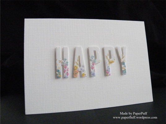
The first was partly a result of playing around with die cut letters on busy patterned paper and partly inspired by a card I have seen somewhere…but I cannot recall. The designer had either stamped a whole lot of flowers and then die cut the letters, or die cut the letters then stamped on the lower portion only. It was a thing of beauty and if I could find it, I could tell you what they had done! I loved the look, but wanted a really quick version so took a shortcut. I selected a floral border from a digikit, resized it, and copied and pasted several times. This would give me lots of choice for positioning my dies. After that I just placed the letters to give plenty of variety in colour and flower. Once cut I popped them onto 3D foam and spent far too long painstakingly positioning them. Not quite as quick as it could have been but there you go. I make my own trouble.
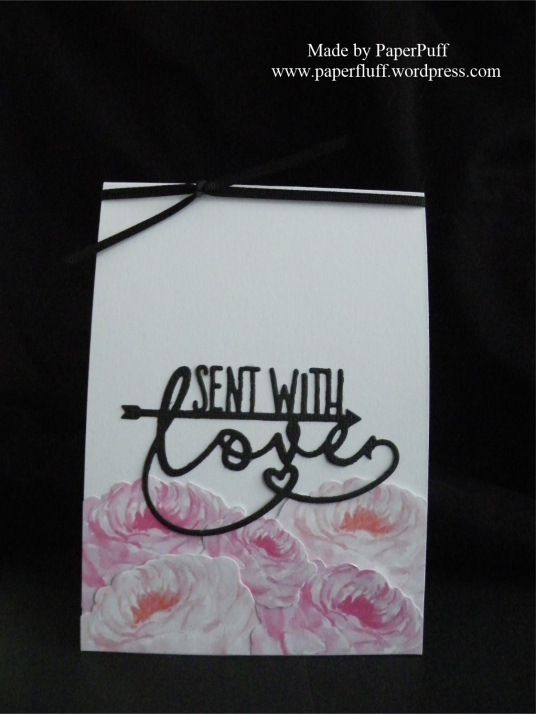
The second card is black and pink. Again. But actually I have been very good and not abused this colour scheme for a while. What can I say? I fell off the wagon and indulged in one of my favourite combinations. The roses are from a Craftwork Cards USB I have had for a while, which includes printables of the totally gorgeous Heritage Rose range. Hurrah! So all to be done was print a page of roses, fussy cut and layer them up. A die cut sentiment from Tonic, a knot of narrow black ribbon and we are good to go.
So, one understated card and one that kind of smacks you in the face, but smells of roses so you have to forgive it…just mind the thorns…
Supplies: XCut Wedding Alphabet and Numbers dies; Tonic Sent With Love die; Craftwork Cards USB including Heritage Rose Collection; Louise Tiler Birthday Florals digikit for Serif CraftArtist; card and ribbon from Create and Craft

So lovely…beautiful really!
LikeLiked by 1 person
Thank you so much!
LikeLiked by 1 person
great cards, both of them 🙂
btw I think mintgreen would do great with black and pink.
LikeLiked by 1 person
Thank you, and I agree!
LikeLike
Ohhhh I love that Happy card! I think I’m having a minimalist phase again
LikeLiked by 1 person
Thanks! I get that phase a lot myself!
LikeLiked by 1 person
Beautiful. Love both of these equally – think it is the pastel colors – makes them look so delicate.
LikeLiked by 1 person
Thank you!
LikeLiked by 1 person
I really like how you use white space, really makes the colours you use pop. I thought those roses were Altenew, they’re very stylish
LikeLiked by 1 person
Thank you! The roses are very similar to the Altenew ones, but just require cutting out, which can be very handy sometimes!
LikeLiked by 1 person
Cutting can be bizarrely relaxing, I like the sound of those, they’re so pretty
LikeLiked by 1 person
I know what you mean. Little bit of calm snipping, or indeed furious hacking, can do wonders!
LikeLiked by 1 person
I would be delighted to receive either of these but I love the first one…
LikeLiked by 1 person
Well given what your most recent post was, I wish I could send it to you Xx
LikeLiked by 1 person
Bless you.😇😇😇
LikeLiked by 1 person
These are both beautiful Gill. That XCut alphabet die set is looking even more tempting….
LikeLiked by 1 person
Thanks Karen! Funny, but when I first got this set, I thought I had made a mistake and didn’t use them. Now I love them!!
LikeLike
Love both cards 🙂
LikeLiked by 1 person
Thank you!!
LikeLiked by 1 person
I love the ‘happy’ one, so simple but so pretty!
LikeLiked by 1 person
Thanks! Simple seems to be my homeland at the moment!
LikeLiked by 1 person
It shows you have skill because I find simple a really hard thing to do!
LikeLiked by 1 person
You are too kind.
LikeLike
Very cool cards! I like the idea of the first one with the die cut letters from printed paper!
LikeLiked by 1 person
Thank you! That one seems to be the one most people prefer!
LikeLike
Just saw your gorgeous cards. I did a card making workshop. It was so awesome but it took me 5hrs to make 5 cards for Xmas. I expect you’re a lot faster.
LikeLiked by 1 person
Thank you. Sometimes I can be fast, sometimes not so much. Especially if I factor in all the blank, ‘staring at the wall’ time. There is a lot of that!
LikeLiked by 1 person
Both of those cards are gorgeous. Just lovely.
LikeLike
These are both beautiful , particularly love the first one. I’m desperate to get making some more cards soon. You make me envious every time you post! X
LikeLiked by 1 person
Aw, hopefully you will get an opportunity to make some cards soon! Thanks for the kind words!
LikeLiked by 1 person
Very nice clean and simple!
LikeLiked by 1 person
Thank you!
LikeLike
Both cards are BEAUTIFUL, Gillian! I did see another floral HAPPY this morning, but that could not have been your inspiration (time zones & all!).
LikeLiked by 1 person
Thanks Kathy! I made mine last week, but I think there are a lot of floral letters about at the moment. As soon as I see one example on Pinterest, more follow. Fashion is fickle!
LikeLiked by 1 person
I know, that is how the companies keep selling us new supplies – gotta keep up!
LikeLiked by 1 person
Yes. But now I am on a mission to attempt the looks from the ridiculously huge stash I already have. We’ll see…
LikeLiked by 1 person
Actually, in February, I was not blown away by any of the “new releases” – just didn’t think I would use any of it.
LikeLiked by 1 person
Both cards are so Beautiful!
LikeLiked by 1 person
You are very kind, thanks!
LikeLiked by 1 person
Aw Puff, these are just incredible. So delicate, so peaceful, so you. I love them both and can’t choose between the two of them. They’re both totally different, but both perfect.
Well done you clever thing. With all the chaos you’re coping with at the moment, I’m in awe that you’re managing to craft anything – so to make something like these two is just a little miracle to me. You’re amazing!
Heaps of love and squidges my wonderful blogging friend ~ Cobs. x
LikeLiked by 1 person
Thanks Cobs! I am a bit behind on all my blogging stuff, and many other things too. But sometimes a girl just needs to get sticking something!!
LikeLiked by 1 person
Indeedly! x
LikeLiked by 1 person
Oh I do love them both! Such great cards! I love the first one with that floral print! They letters really pop! The second one has such pretty flowers, and the color combination is perfect! 🙂
LikeLiked by 1 person
Thanks Nancee!
LikeLiked by 1 person
Two beauties. The letters with the delicate flowers on the first. Oh, so pretty. The large flowers and the black text is fabulous. Very Paperpuffesque. Love them both.
Hugs Flo x
LikeLiked by 1 person
Thanks Flo. I like that word….!
LikeLiked by 1 person
Lovely cards. That ‘Happy’ looks gorgeous.
LikeLiked by 1 person
Thank you. I had thought it might be too simple, but it seems to have gone down ok!
LikeLike
gorgeous!
LikeLiked by 1 person
Thank you so much!
LikeLiked by 1 person
lovely as always
LikeLiked by 1 person
Thank you, kind lady!
LikeLike
Love the floral words, makes for a lovely card! Isn’t it always the way that the simplest things take the most time 🙂
LikeLiked by 1 person
Too true!
LikeLiked by 1 person
So pretty! I love both cards. ❤
LikeLiked by 1 person
Thanks so much!
LikeLiked by 1 person
I love them both. You have such great ideas and they always turn out wonderful!
LikeLiked by 1 person
Thank you! You don’t see the ones in the bin though!
LikeLiked by 1 person
I bet they look pretty good too!
LikeLiked by 1 person
No, they look like cards that have been put out of their misery…!
LikeLiked by 1 person
LOL!!!!
LikeLiked by 1 person
Two more fabulous cards! I’d always use black and pink if I could get away with it, but for some reason men turn their noses up, so they shall keep having neutral toned cards. The floral lettering is very pretty. 😊
LikeLiked by 1 person
Yes, I see your point! Shame you can’t indulge yourself a bit more though!
LikeLike
Both cards are nice, but the white one with patterned letters is my favorite. Very pretty floral pattern and a clever idea!
LikeLiked by 1 person
Thanks! I am going to make more of the patterned letter ones with different words. I liked how they turned out, even though they are so simple!
LikeLiked by 1 person
Yes, this simplicity makes them even better)
LikeLiked by 1 person
I know exactly who you mean, I saw her card too but can’t remember either. She cut the letters and then stamped on them, which I thought was complicating things a little! Yours are really beautiful! Must remember this when I’m in a hurry for a card.
LikeLiked by 1 person
Glad I am not the only one to forget where I saw things! Thanks for the kind words!
LikeLike
I love both of these cards; the cut-out letters with the florals at the bottom are such a great technique – popping them up gives a nice shadow that defines the letters against the background. I don’t have any cut-out letters, but I have some numbers that I will have to try this with!
LikeLiked by 1 person
Yes, it would be pretty with numbers too. Thanks for the kind words!
LikeLiked by 1 person
Oh my goodness. I thought I had already left a reply on this post. In fact, i had to go back and check because I was so sure!
That “Happy” card is lovely. The best part? I can do that! I have never thought of using a busy paper in quite that way. They usually sit in my collection for eons. Thank you!
LikeLiked by 1 person
Ooh, I am happy to help! Thanks for the kind words too!
LikeLike
I love the happy card! So simple, but so effective!
LikeLiked by 1 person
Thank you!
LikeLiked by 1 person
LOVE these set of cards!
LikeLiked by 1 person
Thank you so much!
LikeLike
Oooooh they are both so beautiful! I cant decide which one is my favourite! I am not usually a black and pink person but the second card is so striking!
LikeLike