If you have ever been on the London Underground you will have heard that warning as you get on and off the tube train. I can’t remember now if it is said at every station – I think it used to just be a few that had, for some reason, curved platforms, resulting in a mildly alarming space between the carriage and the platform edge. It was the way the warning was delivered that unnerved rather more. This stern voice, clearly enunciated, booming around the underground hall like some alien overlord. You could see that some tourists were taken by surprise.
But this is a different gap. I made this card for a family member to give to another family member – an aunt. The aunt loves tea, and small floral patterns. Because the card would be posted twice (from me, to them, to auntie) I needed it to be flat. How ridiculous is it that I can send several cards in one jiffy bag for 96p (Large Letter cost), but posting two small cards separately and First Class costs £1.28?? Nuts!
So anyway, flat is required. But I wanted it to be a bit different too, so decided to go for a gappy look. Granted that may not sound too appealing. I guess a career in advertising is not for me. What I mean is that the central motif holds the card together. It is very easy to do.


Grab (or make) a card blank and decide on where you want to position your chosen image on the card front.
Measure down from the top (if you are making a tent fold like me) to where you need to ‘meet’ the image and give yourself a bit of an overlap, of course. Cut the rest of the card front away.
Use this cut piece (or you could go for another colour) to make the bottom section. I went for a panel the same size as the top.
I layered other papers onto the panels, then just assembled the card. Lining up the bottom panel with the back of the card means you should be nice and straight and make sure you only use a little bit of glue or tape of course as you don’t want it showing or sticking the wrong bits!
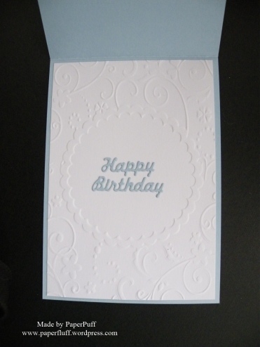
I added an embossed panel inside to highlight the gappy look.
This was made with an old Kraftyhands CD Vintage Chic Boutique. Sadly I think they are no longer in business.

What a beautiful gift. I lived in London back in 1988 for a bit and I can still recall those announcements Mind the gap. Steer clear of the door…😄
LikeLiked by 1 person
Lol, yes, they are imprinted on our brains! Thanks for the compliment!
LikeLiked by 1 person
Yes…not a favourite announcement. I don’t like the “WARNING! THIS vehICLE is REVersing!” one either…I do, however, like your card-a lovely different idea. The postal costs are ridiculous now..perhaps we should invest in some pigeons…
LikeLiked by 1 person
I know someone who breeds prize-winning racing pigeons. Might have to pop one in my pocket….
LikeLiked by 1 person
I think that’s an excellent idea-would come in very useful for the transportation of top-secret policies and it’s a lot more ecologically friendly too 🙂
LikeLiked by 1 person
I’ll put it in the Manifesto….
LikeLiked by 1 person
What a beautiful card! I think “Mind the Gap” is a wonderful name for this line of greeting card style!! 😀
LikeLiked by 1 person
Thank you. I know it was a bit random, but I like random!
LikeLiked by 1 person
Random is fun!!
LikeLiked by 1 person
Very pretty!
LikeLiked by 1 person
Thanks Kathy!
LikeLike
This is so pretty and something very different – super card Gill!
LikeLiked by 1 person
Thanks Karen!
LikeLike
It’s funny on the Metro up here, they don’t say mind the gap, but the number of passengers who say it for them is mad! Stand clear of the doors, please is ours.
Lovely card, really pretty papers and I like the colours.
LikeLiked by 1 person
Haha! Very public-spirited of them! This was fun to make, luckily, as I get really bored with doing totally flat cards.
LikeLiked by 1 person
Really lovely card! Love the papers too, really makes you think of spring and summer 🙂
LikeLiked by 1 person
Thanks Kim! I am with you and looking forward to warmer days.
LikeLiked by 1 person
What a great card! The patterns are so lovely! I can imagine drinking that cup of tea in the Spring sun!
LikeLiked by 1 person
Thank you so much! We had Spring Sun today and it was so nice.
LikeLike
I love the look of the ‘gap’ cards, I had a bit of an experimental phase where I used acetate to create the illusion of a gap. I must have another play… At our rural train station there is no gap warning, but there is a gap. I always have to lift my daughter on to the train as she is a little too adventurous, and I can imagine the gap is both inviting and a bit frightening for her. I could try my best ‘mind the gap’ voice, at least the other passengers may be amused!
LikeLike
every one you make is so adorable!! this one is so sweet!
LikeLiked by 1 person
Thank you!
LikeLike
Beautiful card. Love the design.
Hugs Flo x
LikeLike
oh it’s absolutely beautiful! i made a few cards in this style and they sold out!…
i am pretty sure this card will be very appreciated!
LikeLiked by 1 person
Thanks so much!
LikeLiked by 1 person
Coooo… what a little bobby dazzler this one is! LOVE the papers. Very fresh vintage, and with its toes in the Cath Kidston section. Adore that central image of the Cup (with the roses). It reminds me of a tea set my mum used to have.
So pretty Puff. Well done on a truly GREAT MAKE! I bet this card is a smash hit with the Birthday Girl.
You need to have an Etsy shop, y’know. Your cards are little masterpieces.
Sending squidges ❤ ~ Cobs. x
LikeLiked by 1 person
Thanks Cobs! I love these papers too. They are a ‘go to’ resource for when I need something classically pretty.
LikeLiked by 1 person
Very lovely cards!
LikeLiked by 1 person
Thank you!
LikeLiked by 1 person
Another fabulous creation (I think I shall adopt “Cobs” name of Puff for you too, if that’s ok)? This one will be much appreciated by the final recipient I’m absolutely sure of that. Barb
LikeLiked by 1 person
Thanks so much! And yes, of course you can call me Puff. I rather like it!
LikeLike
Oh this is really cute! I love that image! What a different card idea! Thanks for sharing! 🙂
LikeLiked by 1 person
Thanks for visiting Nancee – I know you must be itching to get back to your colouring challenge!
LikeLiked by 1 person
😂. I needed a break and wanted to visit to see what you were up to!
LikeLiked by 1 person
🙂
LikeLike
This is such a beautiful card! I love the teacup and little floral patterns, and the layout with the gap is so unique. I don’t think I have seen one like it! Something to try soon. Now, as to minding the gap, your opening did bring me back to my three visits to London (all more than 30 years ago.) I remember the admonition to “Mind the Gap,” but for some reason I remember it being on a sign, not really the audio. But I am much more a visual learner, so maybe it is both ways and I just remember the one. However, now that we are on the topic of the Underground, several quirky memories have come flooding back. During my first trip, with my mom, I was in my early 20’s and she was in her early 40’s. We were trying to figure out how to do everything, and when we went through the turnstile to get to the trains, you’d put your ticket in the slot and then it would pop out and open the passage to let you through. But when the ticket popped back out, my mother took it, and then, instead of proceeding ahead, she just stood there, examining the ticket. After a few seconds the side things closed automatically, grabbing her on the bottom, and she pitched forward while I started laughing uncontrollably, which made her laugh, and on and on. I just remember looking up and seeing the expression on the face of the station agent – a mixture of long-suffering and a suppressed smile, trying to maintain composure and reserve in the face of our antics. I also took home a few pieces of toilet paper from the bathroom at the Underground, because I found it so curious that “Now wash your hands please” was printed along the bottom of each square. I know, it sounds crazy, but when you go to a new place for the first time, everything seems amazing and wonderful – even TP!
LikeLike
Lol, yes, every country should have a user manual, shouldn’t it? What is second nature to the natives is a total mystery to a visitor. Your poor mum, being ‘nipped’ by the barriers! And I think that toilet paper was a government institution. I used to work fir the Civil Service back then, and we had it in all the ‘rest rooms’, along with soap that had the Queen ‘s head embossed on it!
LikeLiked by 1 person
Oh, yes, I’m sure that toilet paper was a government-issued program. The Queen’s image on the soap sounds charming! The president’s face isn’t on the soap here, though (thank God for little favors!)
LikeLiked by 1 person
Your Aunt will love this beautiful card i’m sure. What surprised me most in London is having markings off the curb at traffic lights to tell you to look left or right. Saved my life afew times though!
LikeLiked by 1 person
Lol, maybe because we drive on the other side of the road to most countries?!
LikeLike
This card is adorable! I love tea and floral patterns) Hope I’ll try this design one day. Not much time for card making now, but one day…)
LikeLiked by 1 person
Thank you! Finding time for everything is impossible. I love what you are doing with your painting right now though!
LikeLiked by 1 person
Thank you! Little flower paintings can make nice card fronts too
LikeLiked by 1 person
Gorgeous!
LikeLiked by 1 person
Thank you!
LikeLiked by 1 person