Just a post to share a card. No ranting today! This set of stamps is called ‘Adore You’. The feeling is mutual. There are so many differently sized flowers and leaves, and they are kind of retro, I think.
Last night I had an inkling to make a sort of ombre stamped effect, and also to have the flowers roughly decreasing in size as I stamped from bottom to top of the card. I found it easier to work this way to make sure I had the space to use the larger blooms. Knowing me, if I had stamped from top to bottom I would have run out of card before I got to the feature flowers. A bit like telling a joke but starting at the punch line…
Rather than using lots of small ink pads, which would have been a faff, I had a ‘I think I may have something in the back’ kind of moment. Like in an old shoe shop, not like a Brutus and Caesar showdown. And guess what? I found a very ancient Kaleidacolor Rainbow ink pad in shades from orange through to red, which was exactly what I wanted. And even though it is at least 14 years old, it still is totally fine and juicy with ink. Now that is a good product!! The various ink pads are separate when closed (to stop them mixing or contaminating each other) but you can slide them together to make one continuous ombre ink pad. Genius!
I used a dark grey mat as a contrast for all the red and orange. And although I know nobody in the industry reads this, could I still put out a plea for a decent multipack of grey card? Pretty please? It is so difficult to find, especially a really nice charcoal. Also, patterned, and self-patterned greys too, please, whilst you are not here anyway! If any other crafters know where I can get some please let me know in the comments?!
I used Altenew Lava Rock ink to stamp the sentiment (from Dahlia Blossoms stamp set) and a stitched rectangle popped up on 3D foam. Now I could well have finished here. It was a nice enough card, but I decided to take the sentiment rather literally. So, a bit more stamping and fussy cutting and I had some extra blooms. Then I decided I wanted one full-on coloured flower, but once that was on there I needed some balance, hence the green leaves. Initially they were just stamped outlines in pale green, but something jarred so they became full-on leafy. Luckily bed time came along to stop me from further fiddling!
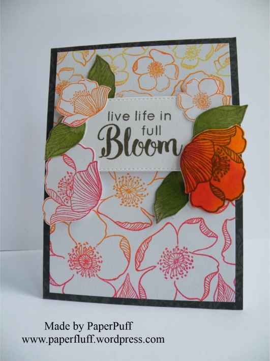

Supplies: Altenew Adore you and Dahlia Blossoms stamp sets; Kaleidacolor Rainbow ink pad in Desert Heat; Altenew inks in Lava Rock, Frayed Leaf and Forest Glades; The Works stitched rectangle dies

I really love this colourful card 🙂 and the layering is wonderful with the one flower coloured in 🙂
LikeLiked by 1 person
Thanks! I wasn’t sure, couldn’t decide, dithered… you know how it goes!
LikeLiked by 1 person
oh yes it is so easy to dither and unsure. I spend time playing with my layouts then leave a layout and come back another time to stick it down only to change it yet more times before finally setteling for a layout as i begin to get frustrated with myself.
LikeLike
What a beautiful card! I love the flower stamps and the colours you have picked are gorgeously bright and cheerful! 🙂
LikeLiked by 1 person
Thanks Karen! Not my usual comfort zone but got to step out sometimes. Have a good weekend!
LikeLiked by 1 person
You too Gill!
LikeLike
Beautiful work honey!! You are so inspiring!
LikeLike
This is really pretty, and I am very impressed that your ink pad was still alive after all that time. I struggle to find nice greys too, I’ve got some in the stash I inherited, but nothing was labelled so I don’t know how to replace it
LikeLiked by 1 person
Thanks, and it the grey thing is maddening, isn’t it? Maybe grey ink costs too much…
LikeLiked by 1 person
I just spotted a corals set of card on Create and Craft which includes a grey, but I’d like a full set of shades of grey
LikeLiked by 1 person
Yes, me too.
LikeLiked by 1 person
Great Card 🙂
LikeLiked by 1 person
Thank you!
LikeLike
Your cards are always so beautiful! The little extra touches are so cool!
LikeLiked by 1 person
Oh good, thanks! I did wonder it I had gone a leaf too far!!
LikeLiked by 1 person
It looks perfect. I totally understand the second guessing. I always stand and look at my cards and wonder…”Just a little more bling?”
LikeLiked by 1 person
Amazing and gorgeous like always.
LikeLike
Gorgeous, the flowers are a perfect background for the the coloured in one which pops beautifully! 😊
LikeLiked by 1 person
Cheers! It was fun to make, although I did wonder if I should have fiddled less.
LikeLike
Lovely card! The flowers – they remind me of wild roses, and I like the colour effect too 🌹🌹🐱
LikeLiked by 1 person
Yes, you’re right. I knew them as dog roses. I hadn’t thought of that but now I can see a ‘vintage’ side to them too. Thank you!
LikeLiked by 1 person
Beautiful card, and great message. I really like the gradated colours, and those flowers look so sweetly vintage. 🙂
LikeLike
What a beautiful card, Gillian! Now you have me scrambling to see if the Kaleidacolor pad in Offspring3’s abandoned craft stash is still workable. 😉 And…just a suggestion for the future…if you wanted the big flowers at the top, you could have just rotated the stamped paper before mounting it on the grey.
LikeLiked by 1 person
Haha! And maybe I didn’t explain it right! I definitely wanted the big flowers at the bottom, but figured if I started stamping at the top and worked down the card that I might stamp too many smaller flowers and not have space left for the larger ones. So I started at the bottom. Does that make better sense? I am not good at describing these things! Have a great weekend!
LikeLiked by 1 person
My mistake! {insert blushing emoji} Have a great weekend!
LikeLiked by 1 person
Nah, we are always all good, hopefully!
LikeLiked by 1 person
Oh so lovely! I have a weak spot for ombre…but no such thing as ‘I think I have something in the back’ haha… Have considered to buy an ombre ink pad but just hasn’t happend yet… This sure makes me want at least one! 🙂
LikeLiked by 1 person
Yes, I saw something similar on a website and remembered my old stash. Sometimes keeping stuff is good!
LikeLike
Love this!!
LikeLike
That is BEYOND a card. That is a wall hanging. I can’t get words around how artistic you are. SOOOOOOO amazingly talented. Do you have an Etsy shop, by any chance?
LikeLiked by 1 person
Oh, thanks! And no, no shop. I am too chicken. Took me years just to use Pinterest and another couple of years to blog! Maybe one day.
LikeLiked by 1 person
I understand. 😊😊
LikeLiked by 1 person
I really love it! It’s perfectly balanced and ombre looks so good!
LikeLiked by 1 person
Thank you! I thought I had gone a leaf too far.
LikeLiked by 1 person
Stamped flowers look almost like patterned paper, so it doesn’t seem to be too much.
LikeLiked by 1 person
Thanks!
LikeLiked by 1 person
Nice! Grey is so underrated as a neutral for crafting, imo.
LikeLiked by 1 person
Yes, absolutely.
LikeLike
Love!
LikeLiked by 1 person
Thank you!
LikeLiked by 1 person
This card is gorgoeus. Its no secret that I love flowers but the coloring on these are fantabulous! =)
LikeLiked by 1 person
Thank you. Fantabulous is pretty darn cool. Cheers!
LikeLiked by 1 person
Beautiful card. I love the solid flower on the beautiful ombré. I am with you I would run out of room too. That was a good tip to start at the bottom. I struggle with finding the right shade of grey too. Another awesome post despite the non rant! 🙂
LikeLiked by 1 person
Thanks! Although I might rant more often. Very cathartic!
LikeLiked by 1 person
It is unhealthy to keep things bottled up.😁
LikeLiked by 1 person
Such a great design, and pretty colours!
LikeLiked by 1 person
Thank you. I was visiting the 1970s in my head, I think.
LikeLiked by 1 person
Stunning card, I love the colours and contrast with the green leaves. Thanks so much for sharing, it’s great to read about your thinking process. Happy Saturday 😊
LikeLiked by 1 person
Thank you! I have popped over to see you but I guess you are just getting started. I have followed – your name was enough for me! Have a good day!
LikeLike
Beautiful!
LikeLike
Beautiful!
LikeLiked by 1 person
Thanks!
LikeLike
Wow – among my favorite of your many cards. Must be the flowers and the coloring. The “Live Life In Bloom” made me think – what a great life that would entail. Thanks for sharing.
LikeLiked by 1 person
Well thank you so much! And yes, you are right about the sentiment!
LikeLiked by 1 person
I get so excited to read your posts Puff!! I love your stories and then BOOM!! There are these simply amazing cards that you so delightfully describe the creation and inspiration for them. I love the sentiment on this card. I would like to think that I would be like a dandelion – bright and sunny one day then going to seed and being blown away by a breeze the next day!! 😀
LikeLiked by 1 person
Surely not going to seed? Noooooo! Although dandelion heads are pretty cool.
LikeLiked by 1 person
This is so lovely!! ❤
LikeLiked by 1 person
Thank you so much, and thanks for stopping by.
LikeLike
You’re most welcome! ❤
LikeLiked by 1 person
Gosh I love the colors you chose! I have some outline stamps that would look fab with this technique. Thanks for the inspiration! BTW, Club Scrap has fabulous card stock. Single sheets are available. The Paris Flea Market collection has plain and patterned grays. http://www.clubscrapshop.com/store/c/24-Paper.aspx?pi=11
LikeLiked by 1 person
Thank you! And thanks for the link!
LikeLiked by 1 person
You’re welcome!
LikeLiked by 1 person
A really special card! I can see these flowers as wild roses or dogwood, but with the color you’ve used they remind me of poppies – and maybe a 1970’s retro style. I have some of those Kaleidacolor pads too, about as old as yours. I just pulled some them out and tried a couple – still inky!
LikeLiked by 1 person
Yes, I was thinking of some old wallpaper we used to have when I made this one! Thank you! Sounds like quite a few of us have the ink pads still. A product with stamina!
LikeLiked by 1 person
Oh so pretty! I love all the different colors you used! Lovely bright card! 🙂
LikeLiked by 1 person
Thanks Nancee!
LikeLike
Hello Puff. (still on catch-up hence the late comment on this fabulous card)
What a glorious design and colours. Really well made and stamped brilliantly.
Grey card:
Craft Essentials – Owl Grey Card (Hobbycraft have it if you can’t get it anywhere else).
Creative Expressions – 220gsm – in a pack of 25 sheets.
Also … try Amazon. I’ve just had a peep and they seem to have a plethora of grey card, but I didn’t actually click into any of the offerings so can’t tell you what gsm or size, or even how many in a pack. But … take a peep and you might find the very thing.
(Have you tried Ebay too?)
GREAT card missy. But then … you only make great cards. I’ve never found a duff one out of all your cards! 😀
Squidges ~ Cobs. x
LikeLiked by 1 person
Thanks Cobs. Late comments are never a problem!! Cheers for the suggestions, I will check them out. Glad you like the card. I think I was channelling some 1970s wallpaper…..
LikeLike
What a pretty card! I’ve been looking at those ink pads and may have to try one now.
LikeLiked by 1 person
Thank you. I had almost forgotten about them!
LikeLike
Papermill Direct do a nice slate grey card and a darker charcoal pearlised card.
Love the ombre – I’ve never tried the kaleidacolor ink pads – and the layers work really well.
LikeLiked by 1 person
Thanks, and thanks for the tip-off.
LikeLiked by 1 person