Mind the Gap

If you have ever been on the London Underground you will have heard that warning as you get on and off the tube train. I can’t remember now if it is said at every station – I think it used to just be a few that had, for some reason, curved platforms, resulting in a mildly alarming space between the carriage and the platform edge. It was the way the warning was delivered that unnerved rather more. This stern voice, clearly enunciated, booming around the underground hall like some alien overlord. You could see that some tourists were taken by surprise.

But this is a different gap. I made this card for a family member to give to another family member – an aunt. The aunt loves tea, and small floral patterns. Because the card would be posted twice (from me, to them, to auntie) I needed it to be flat. How ridiculous is it that I can send several cards in one jiffy bag for 96p (Large Letter cost), but posting two small cards separately and First Class costs £1.28?? Nuts!

So anyway, flat is required. But I wanted it to be a bit different too, so decided to go for a gappy look. Granted that may not sound too appealing. I guess a career in advertising is not for me. What I mean is that the central motif holds the card together. It is very easy to do.

Grab (or make) a card blank and decide on where you want to position your chosen image on the card front.

Measure down from the top (if you are making a tent fold like me) to where you need to ‘meet’ the image and give yourself a bit of an overlap, of course. Cut the rest of the card front away.

Use this cut piece (or you could go for another colour) to make the bottom section. I went for a panel the same size as the top.

I layered other papers onto the panels, then just assembled the card. Lining up the bottom panel with the back of the card means you should be nice and straight and make sure you only use a little bit of glue or tape of course as you don’t want it showing or sticking the wrong bits!

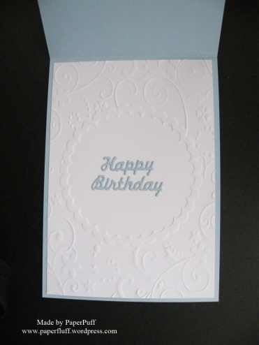
I added an embossed panel inside to highlight the gappy look.

tea gap 3


This was made with an old Kraftyhands CD Vintage Chic Boutique. Sadly I think they are no longer in business.


Florals Two Ways

I have a quick post today – two cards using florals and a lot of white space – but with quite different results.

The first was partly a result of playing around with die cut letters on busy patterned paper and partly inspired by a card I have seen somewhere…but I cannot recall. The designer had either stamped a whole lot of flowers and then die cut the letters, or die cut the letters then stamped on the lower portion only. It was a thing of beauty and if I could find it, I could tell you what they had done! I loved the look, but wanted a really quick version so took a shortcut. I selected a floral border from a digikit, resized it, and copied and pasted several times. This would give me lots of choice for positioning my dies. After that I just placed the letters to give plenty of variety in colour and flower. Once cut I popped them onto 3D foam and spent far too long painstakingly positioning them. Not quite as quick as it could have been but there you go. I make my own trouble.

flowered-happy-white

The second card is black and pink. Again. But actually I have been very good and not abused this colour scheme for a while. What can I say? I fell off the wagon and indulged in one of my favourite combinations. The roses are from a Craftwork Cards USB I have had for a while, which includes printables of the totally gorgeous Heritage Rose range. Hurrah! So all to be done was print a page of roses, fussy cut and layer them up. A die cut sentiment from Tonic, a knot of narrow black ribbon and we are good to go.

sent-with-love-and-heritage-rose

So, one understated card and one that kind of smacks you in the face, but smells of roses so you have to forgive it…just mind the thorns…

flowered-happy-and-sent-with-love

Supplies: XCut Wedding Alphabet and Numbers dies; Tonic Sent With Love die; Craftwork Cards USB including Heritage Rose Collection; Louise Tiler Birthday Florals digikit for Serif CraftArtist; card and ribbon from Create and Craft


Quite..erm..pinteresting?

Whilst I was away from Bloggyland recently, my most ‘successful’ personal creation hit 1000+ pins on Pinterest. I have already posted about this before when it hit 500+ pins and I was cock-a-hoop pretty pleased, and this post is not just another excuse to do that, although I see no reason to be falsely coy or say ‘oh, that old thing?’ Now though, they stop counting, and it just has 1k pins beside it, so, fickle to the end, I have rather lost interest! Maybe, if it ever gets to 2k, I might get excited again. I might also be in a residential home eating pureed vegetables and telling inappropriate jokes, who knows?

This post is more about what does, or does not, get re-pinned. Again, I did mention this previously: I am fully aware that the card is not a work of genius, and it has been made with a very popular and relatively new range of stamps which undoubtedly helped. It is nice, I think, but I am not deluded. It is not ‘amazing’. It is though, perhaps, something which, as a beginner with an interest in card making, you could look at and think ‘yes, I can do that with no problem’. And to be honest I think this of most of the cards I make. I know I generally ‘execute well’, and my work is neat and well finished, but not exceptional. I am ok with that (no choice really!).

But what interests me is: how do we make our pinning choices? Why do we re-pin? Because something is achievable, or aspirational, or just because we may as well save it ‘because we can‘? I have boards and pins for hundreds of things I am pretty sure I may never make, or buy, or visit…. I pin cards that I could never hope to produce the like of if I lived to be 150. Is that just me?

I have a few cards now that have a few hundred pins, but it has taken a long time. I’m sure for other people this happens way, way quicker. For me, I thought to use it as a gauge of what people may or may not like. But here is where I am stuck, and going back to the “what appeals“ question. It seemed to me that Pinterest would be a good way to check this.

Here is my example of the dilemma. Months ago I pinned two cards on the same day, which were, broadly, the same card but upside down and downside up. One has had WAY more pins than the other: 427 vs 110. So is one visually much more pleasing?  If so, is it obvious to everyone except me, and is there a reason? Feel free to say (nicely!) – I’d like to know! I made them so I cannot tell for sure; I do have a slight preference, but it is only slight.

Or, is it just luck? Of all the pins in all the world, someone comes across one of yours, but only one…

I am thinking about doing an experiment. Two cards, in the ‘same but different’ category, probably pretty much the same layout as these. Then I will pin them and wait (for months, I know) to see if none, one or both get re-pinned. I would have made them to include in this post but any creativity I had is hiding behind the sofa this week and refusing to come out.

If anyone else fancies trying the same experiment, let me know and I’ll re-pin yours. Oh, and to be fully scientific (because I have been rigorous so far, right??!) there should probably be a ‘control’ as well, so something entirely different but pinned on the same day. Pehaps even make it a howler, just to see!

If you should choose to accept the mission, good luck, and get sticking! This post will NOT self destruct in 5 seconds…


Using up leftovers

I don’t mean making a gourmet meal from the remnants of today’s feast. I cannot do that. If what was left was a few cold roast potatoes or a vegetable medley then that is exactly what you would get served back up again. With perhaps a garnish of fresh herbs, if I have them. But I am BRILLIANT at saving leftovers, because we all know we should do it. Unless you are clever enough to only prepare exactly the right amount of food in the first place. Not me: there is always a bit of surplus. So everything gets covered, wrapped or bagged to protect it against unspecified dangers and added to the contents of the fridge. Then, somewhat surprisingly and pointlessly given that the universe needs to be protected, the chaps from Men in Black turn up, erase my memory with their special mind-wipe gizmo and the delicious morsel is forgotten. Completely. And rendered invisible too, just for good measure and in case I should happen to go back to the fridge in the next few days (?!) and spot it. This lasts only until fridge clear-out day, obviously, when I rediscover the leftovers and do a comedy forehead slap to indicate my own stupidity. I don’t actually leave them in there until they evolve into a sentient life form, able to walk out on their own, introduce themselves in Esperanto or Panglish and ask for a razor and a  decaf latte…

So, crafty leftovers then, grab the attention rather more. These cards were rustled up from superfluous Altenew Painted Flowers lying around on my craft table. Rather than squirreling them away, doubtless never to be found again, I am determined to use up such scraps somehow. They won’t be any good for bubble and squeak (sorry, probably only Brits will know what this is!) so cards it is.

This is (almost) the last of the yellow flowers I have stamped recently.

AN yellow leftovers card


These pink flowers are quite muted. When I first got the stamps I tried and loved a black outline, but also tried it in grey and was less sure. But now I have put them with more grey and a softer look works fine, I think. Also, I made the spotty background myself! Whoo-hoo!

AN pink leftovers card

Both cards are really quick once the stamping is done, and even that doesn’t take long!


An accidental Yoda

This is a second card from the Paradise Crush pad designed by Louise Tiler. I have used the same template as last time too. Working with the different shape is really doing it for me at the moment.

Awesome Paradise Crush

I have stamped and die cut another of the Altenew Super Script words and then decided to cut a window in the front of the card as a bit of an extra feature. But it looked a smidgen unfinished so I decided to frame it with an asymmetrical shape. Not quite as easy as I thought, partly because I am allergic to asymmetry, and partly because you have to make the aperture in a surprisingly large piece of card and then cut it down to size at angles to achieve the shape you want. There is a lot of opportunity to get it wrong, as my first few attempts prove. I also tried the frame in black but it was a bit too severe and, figuring another pattern might just give me a migraine, white it is. I knew I wanted the ‘you are’ sentiment in their too, but the only place it looked right to me was where it is now, thus creating my accidental Yoda “Awesome, you are”. I will bluff it out and claim that as it is higher up, the ‘you are’ should be read first!

Part way through, watching the Wimbledon tennis final, I realised I should have used this sentiment with some tartan so I could dedicate it to Andy Murray. Probably missed that opportunity now as I am pretty sure glittery flowers are just not quite his thing. Ah well there’s always next year!

Quick, quick, slow…

One super-quick card and one which should have been quick, but….

I am running a bit low on general birthday cards, so wanted to rustle up a few quick ones. And, if I can fool people into thinking they took ages, so much the better. I know you can’t fool a crafter, but most people I know would struggle to define ‘double sided tape’ and would think a bone folder would most likely be an implement of torture or medieval medicine, probably to be used alongside some leeches. So, with a bit of smoke and mirrors I might get away with it.

Super-quick one first. This is Anna Griffin cardstock, already cut to size. I matched the cream colour in the pattern as best I could from my stash and the blue from my inks. I used a Tattered Lace Charisma Frames 1 die, which I ran through an Anna Griffin embossing folder, stamped the sentiment onto the same cream card and cut out with a Spellbinders oval. Some 3d foam and a ribbon flourish to finish. Done in minutes.

AG cream and blue

Now for the one I had to rugby tackle into submission. The only reason it was a bit trickier was getting a good cut on the die. This is a large floral panel from Tattered Lace (I have lost the packaging so cannot tell you the name). Using my Big Shot and with all the tabs on the Universal Platform closed, it felt just too tight to get it through the machine safely. But running it through with one tab open was no good either as it just didn’t cut at all. I ended up with a sort of princess and the pea pile of card underneath the die and cutting plates to act like a booster seat. I had to run it through the machine many, many times, shim certain spots and even then, when it looked ok I realised it hadn’t cut everywhere so ended up attacking it with the craft knife to finish it off. As in, complete it, not hack it to bits in a fit of pique. Although it did cross my mind.

Once cut to satisfaction, it is just a case of trimming round where the flowers join to get the line you want at the bottom. Leave the rest intact until you stick it on to your base card, overlapping the sides and top. Then trim. The stamped greeting is Anna Griffin again, and the die is the same set of Charisma Frames used for the first card. I chose an off-white shade for the card base as pure white looked a little too harsh, and because I have an enormous roll of ivory ribbon!

TL floral panel silverTL floral panel silver detail

I see duck feet in the petals of the flower on the right, no?


Kinda Anna?

The UK is reeling from the fallout of the Brexit referendum. I’m giving nothing away about how I voted, but reactions of other people to the result, and to each other, have been interesting. It seems the ’out’ verdict was a surprise to pretty much everyone I spoke to; a few who told me they had voted to exit the EU said they hadn’t thought the (small) majority would vote the same way. I think some were perhaps ruing their choice. Others were slightly stunned that it had happened, but were looking ahead with something like interest or curiosity. At work apparently an ‘in’ voter had to be calmed down after a furious tirade aimed at work colleagues who had ticked the ‘out’ box! Who knows what will happen. There is a strange feel to today.

Anyway, enough of the news, and back to the papers (!).  I’m with my Anna Griffin stash again. I really want to use a lot of it up, not because I don’t like it any more, far from it, but because otherwise it will get battered and tattered, faded and dog-eared. Not a fair way to treat such gorgeousness. Or, indeed, such financial investment!

This card took me a while, just because I could not make up my mind about what to put where. Same dilemma as I had voting yesterday! I think it is perhaps a bit closer to the Anna Griffin look I love?

AG brown cream rose card

I haven’t used a peel-off border sticker in ages. When I first started out card making they were practically compulsory! A long time ago I totally fell out of love with them alongside so many other crafters, but every now and again they are just exactly what I want. This card is old school, so old school equipment is fine! Everything else except the ribbon and Brilliance Pearlescent Olive ink for the sentiment is from my Anna Griffin stash, including the punch to make the border strips.

AG cream borwn rose card detail

Searching for my Inner Anna

Don’t worry, this is not a call to self-examine with a mirror and a yoga position. I mean Anna Griffin, supreme mistress of all gorgeousness. I have bought tons of Anna Griffin products over the years – mostly stamps and papers but a few other goodies too – and I regularly get them out, look at them, shove them around the table a bit and then give up and put them away again. I think it is because I know that whatever I try to make will not come up to the ideal I have in my head. I simply cannot achieve those ‘fully loaded’ cards. I wish I could, but there it is.

However a recent change of mindset has led me to give it another go. I am not going to try and copy Anna’s style; I realise my past failings at this have led to the products not being used, and they are way too lovely for that. It is a crime against paper and ink! So I am just going to use them my way and see what happens.

AG Black grey pink card

This is the first effort. I can’t believe I produced yet another black and pink card! I swear, I don’t even realise I am doing it! Only halfway through did I look down and think ‘oh phooey’ (that wasn’t the word, obviously!!) ‘I’ve done it again!’ So I might have to banish some of the goodies back to the drawers again, to give other colours a look-in.

AG Black grey pink card detail

Because I have had all these products for years, I cannot tell you the names I’m afraid, but the stamp and patterned papers are by Anna Griffin. The sentiment might be from a Chalkboard range, but I can’t be certain! The flower was also made ages ago. Because it is made with paper clay and takes several hours to dry I just have a bag of them all made up in case I have a paper-clay-flower-related emergency situation. The mould was from Tonic.


Let’s play a game!

AN Green grey spotty

The game is ‘what is wrong with this picture?’ Let me quickly give you a clue before I get any unwelcome suggestions. What is the word missing from all the following:

Earl ____ tea

Lady Jane ____

50 Shades of ____

GREY!!!!! When I stamped and cut out these flowers yesterday, I used grey inks. They looked pretty good and I had the design all mapped out in my head. When I came to work with them today, they had all turned green! How the hell did that happen? The inner child cries out “Elves!” whilst the more mature brain suggests “the ink must have reacted weirdly with the card you used”. I prefer the first suggestion, as I would hope to be able to train visiting elves to tackle the housework instead, but I guess that the ink and paper not getting along is the more likely scenario. So now I have a whole load of cut out green roses and leaves. I don’t want to bin them as they took a while to do, so a rethink is required. I tried out all sorts of colour combinations but as green roses don’t figure much in the real world, most of what I offered up just looked wrong. Then, I came across the spotty card base and thought it might work better than the pastels I had been trying, and I quite liked it. Black was an obvious choice for this second card, with a pale lemon to soften it a bit.

AN Green grey black

Not at all what I had planned but sometimes it just goes that way!

Supplies: Altenew Vintage Flowers stamps and dies; Craftwork Cards spotty card base; The Ribbon Room striped ribbon


Missing Links, and why I have never climbed Everest

So yesterday I mentioned that I had never done bloggy links and was not sure how to do it. But yay! I tried and they worked. My missing links are missing no more.

Really what I should have done was learnt how to do it a few months ago when I first started, but I am a terrible procrastinator with things like this. I tend to think ‘I’ll find out how to do it when the need arises’, as opposed to equipping myself with all the necessary tools and skills at the outset.

That’s why I’ll never climb Mount Everest. I’d get to the first hilly bit (!!) and realise I didn’t know how to say ‘crampon’ in Nepalese. Or Tibetan. Time to resort to the international language of mime, so oft adopted by the English abroad. Then imagine miming ‘crampon’ without resorting to a “sounds like” depiction that would only lead to confusion or embarrassment for all parties, and no satisfactory outcome.

Best leave mountaineering to others, then. However, what I have done is made a card bright and larey enough to leave at base camp and use as a beacon should you get stranded part way up. Actually I think you might be able to see it from space. So, to all legitimate mountaineering expeditions departing for major peaks any time soon, contact me and I will happily make you a beacon card to guide you to safety. (Do I need some kind of waiver here?!)

cwc heritage rose black dotty card

Back to blogging tech things. What I also need to do is go find those little yellow faces that everyone uses. Is there one with its tongue stuck firmly in its cheek? It may be needed….

Supplies: background and green patterned papers, flowers and sentiment are from Craftwork cards; Frame die is Tonic Keepsake Indulgence; gold card from Create and Craft.