Blogging break

Just a quick post to say that I will be taking a break from blogging for a while. Not sure how long it will be yet. Sorry, I know I have comments to reply to but I am not sure if I will get a chance in the next few days. Also I don’t know how much I will be able to keep up with posts from the blogs I follow. Probably not much.

Apologies, please don’t think I am ignoring you!

No, I am not in prison.

No, I am not in the Witness Protection Programme.

Just someone close to me needs a bit of looking after for a while.

Oh, and they have a LOT of stairs.

PaperPuff is already puffed out. Xx


Colourful cards for men

Because not all cards for men have to be navy or brown….

I have to confess to a crime against craft. This week, whilst once again braving Stash Mountain, I came across a couple of sets of dies I had never used. Actually I have quite a few sets like that, but these ones I had also forgotten about. Tsk! I believe I may have mentioned this before, but the rule is, in order not to further upset the Gods of Craft, once such items are discovered, you gotta make something.

These are simple silhouette dies, all of a sporting ilk. I seem to remember they were a bargain, hence the purchase. Also we have quite a few ‘young men’ (translate as ‘significantly younger than us‘) in our family and I am just never prepared with cards to give them. A bit rubbish really, considering how much kit I have to hand. But stuff for younger people seems to date so fast. The ‘technology’ that was a feature of card toppers I bought, say, five years ago now probably looks to them like it might have been used to steer a tall ship in the 1800s. But hey, a shadow remains constant. Well, no, not at all really, always changing in fact…but last time I checked we all still had one…unless you live in Britain, with no sunshine…and I think there was an issue with Peter Pan…heck this is not going well at all…

Ahem. Let’s get this back on track. Anyone want to see a card? I decided to go bright, and bright-ish for these. Why not? Colour is fun and silhouettes lend themselves to a splosh of the primaries.

For the first card I used the basketball player and three different splat stamps in the primary colours. I was OK with it but though it just needed a little more, so stencilled some grey spots at the top for a bit more interest. I also stamped splats onto the envelope and one behind the greeting on the inside. In the photos the red looks a bit pinkish. It isn’t though!

sporting silhouettes basketball 1sporting silhouettes basketball 2

For the second I was considering doing pretty much the same, but in slightly softer tones and with a footballer (soccer player, to my North American pals). But recently I have seen a few examples of cards with a partial circle cut out at the edge and thought this might be fun for a change. Because the black layer looked a little austere just left plain I also used my Halftone stencil, this time with embossing ink (Versamark) and clear embossing powder. This gives it a bit of texture without (hopefully) being too girlie. Again I decorated the envelope a bit. Well, why not?

sporting silhouettes footie 1sporting silhouettes footie 2

I still have tennis, rugby and golfer dies to play with! I will probably make at least one blue or brown card. Ah well.

Supplies: Trimcraft Sporting Silhouettes dies; Altenew Birthday Greeting and A Splash of Color stamps, Halftone stencil


A knitted dog blanket, and a sort-of pattern

Please don’t judge me on the colour scheme. My yarn choices were very limited!

Don’t get excited anyone, this is not a proper professional pattern post. More of a ‘this is how I made it work for me’ kind of thing.

A little while ago I posted about making dog blankets for Battersea Dogs and Cats Home. Well, I started the blanket pattern that could be downloaded from their site, but I was having some issues. My ‘squares’ were anything but square and the different paw patterns were yielding different sized rectangles. Obviously I assumed it was my fault, that my tension was off, or varying wildly. Also perhaps the cheap acrylic (Battersea state they want acrylic) was not helping. It felt like the thickness varied a bit. But, seeing as I was going to have to sew the 25 knitted squares together, quite large discrepancies in size was going to be tricky.

Then the amount of sewing involved was putting me off a bit. I wanted a kind of ‘zone out’ project, where I could just knit and get back into the rhythm of needles and knots again. Without wishing to seem uncaring towards the eventual owners, I would rather be able to make three ‘no brainer’ blankets than one thing of beauty. Bearing in mind the thing of beauty might only last a week or two, it might be chewed, or thrown up on…well it seems to me that less finagling and more bulk would be a better option.

After speaking to my mum, who had already made the paws blanket, I found out she had exactly the same issues and, coming to the same conclusion, had made a simpler striped one as her second.

I decided to make a striped one too. And I wanted a border around it, to stop that curling up thing that happens otherwise. Please remember here that my knitting knowledge was never vast, and it is old and neglected. But, in a rare moment of knitting optimism, I decided to work it out for myself.

So, here we have the blanket that I actually wanted to make, if you ignore the colours that were dictated by the minimal array of shades in the shop.

Not many close-ups as my edges were a bit dodgy at first!

Now, I can’t write it up as a proper pattern, but should you want to make such a thing yourself, this is what I did, and what I used.

5mm needles

Baby yarn (thinner than DK, that is all I can tell you): two 50g balls of white, and three 50g balls of other colours. You will have plenty left over and don’t need two full balls of white, but my method of knitting made it easier. If you don’t know how to work different coloured yarn in, it is probably best if you go find out from a professional. YouTube will do the trick. Basically I just wrap the two colours of yarn around each other either side of the changeover stitch.

Cast on 100 stitches*

K rows 1-10 in white

Row 11; K8 in white. Work in colour choice as described unhelpfully vaguely above. K to last 8 stitches, change to white and K last 8

Row 12: K8 in white. Work in colour choice and purl to last 8 stitches, Take a second ball of white yarn, work in as per intarsia method and K8 in white.

Continue rows 11 and 12 until work is desired length, ending on a purl row of colour.

K 10 rows in white and cast off.

Weave in all ends.

That is pretty much it. I just changed the colours and stripes as I fancied – basically trying to make it a bit less like an object that can be seen from space. They will have no problem finding this blanket’s pooch in a power cut!

*As for the number of stitches, I was being guided by the paws blanket which knitted up to 50x50cm sq. I figured this must be a minimum size requirement for Battersea so just aimed for something a bit bigger. The finished blanket is 62x55cm so I could have used less stitches.

I will still finish the knitted squares blanket, as it is a nice diversion and the paw pattern does look really cute. I am in no way criticising it, this is just an honest opinion. I think it is brilliant that the designer allowed their pattern to be used in this way. I thought the intention was to give knitters an interesting project achievable for all skill levels, and it definitely is.

I have now come across a few more proper patterns so am going to use up the rest of the yarn. Maybe I should include some sunglasses when I post them off?

Finally, a gratuitous picture of my lovely Photographer’s Assistant, having a quick bit of shut-eye in the props after a hard afternoon napping…

riley in blanket


When the caffeine is taken away…

Yesterday I had zero caffeine. By choice, not some horrible deprivation torture inflicted by a heartless monger of alternative hot drinks. I don’t drink much – usually just one or two mugs in the morning and that is it. Rarely past noon (that is 12PM lunchtime in the afternoon to some TV presenters) as I am a serial rubbish sleeper so why throw another obstacle into the mix? But last night despite being a caffeine free zone I just couldn’t nod off and eventually got up and made a card. And, well, as you can see, I was perhaps a little preoccupied…

Coffee cardcoffee card detail

I wonder what was on my mind?!

I wanted to use some coffee beans in the photo but there are none in the house. A pile of instant coffee is not too appealing. Galaxy Counters are as close as I could get! It’s OK, they have already gone to a good home…

Supplies: Clearly Besotted Warm Wishes stamps and dies; Altenew Coffee Talk stamps; Hunkydory Adorable Scorable spotty and striped card; The Works stitched rectangle nesting dies


Ombre stamping

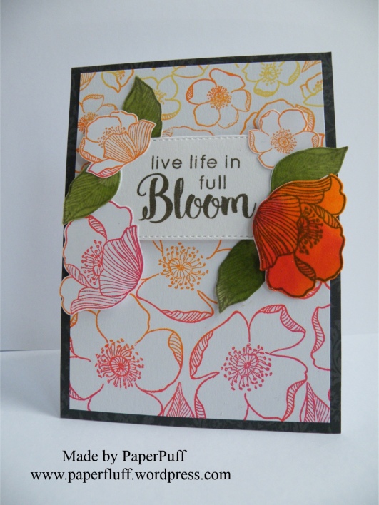
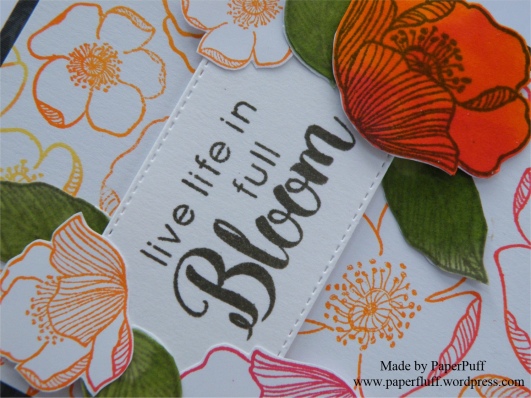
Just a post to share a card. No ranting today! This set of stamps is called ‘Adore You’. The feeling is mutual. There are so many differently sized flowers and leaves, and they are kind of retro, I think.

Last night I had an inkling to make a sort of ombre stamped effect, and also to have the flowers roughly decreasing in size as I stamped from bottom to top of the card. I found it easier to work this way to make sure I had the space to use the larger blooms. Knowing me, if I had stamped from top to bottom I would have run out of card before I got to the feature flowers. A bit like telling a joke but starting at the punch line…

Rather than using lots of small ink pads, which would have been a faff, I had a ‘I think I may have something in the back’ kind of moment. Like in an old shoe shop, not like a Brutus and Caesar showdown. And guess what? I found a very ancient Kaleidacolor Rainbow ink pad in shades from orange through to red, which was exactly what I wanted. And even though it is at least 14 years old, it still is totally fine and juicy with ink. Now that is a good product!! The various ink pads are separate when closed (to stop them mixing or contaminating each other) but you can slide them together to make one continuous ombre ink pad. Genius!

I used a dark grey mat as a contrast for all the red and orange. And although I know nobody in the industry reads this, could I still put out a plea for a decent multipack of grey card? Pretty please? It is so difficult to find, especially a really nice charcoal. Also, patterned, and self-patterned greys too, please, whilst you are not here anyway! If any other crafters know where I can get some please let me know in the comments?!

I used Altenew Lava Rock ink to stamp the sentiment (from Dahlia Blossoms stamp set) and a stitched rectangle popped up on 3D foam. Now I could well have finished here. It was a nice enough card, but I decided to take the sentiment rather literally. So, a bit more stamping and fussy cutting and I had some extra blooms. Then I decided I wanted one full-on coloured flower, but once that was on there I needed some balance, hence the green leaves. Initially they were just stamped outlines in pale green, but something jarred so they became full-on leafy. Luckily bed time came along to stop me from further fiddling!

adore you ombreadore you ombre detail

Supplies: Altenew Adore you and Dahlia Blossoms stamp sets; Kaleidacolor Rainbow ink pad in Desert Heat; Altenew inks in Lava Rock, Frayed Leaf and Forest Glades; The Works stitched rectangle dies


A problem with time

Early warning, this is a post with a tiny little rant. And a card, of course, so you can just skip to the pictures if you want! Well obviously you can do that anyway….!

So, the rant. Let’s start it with a question, in case I am completely out of order here and should be told to button it. Have the rules about telling the time changed? Has there been a vote in Parliament that didn’t make it onto the TV news, or wormed its way into any conversation I have had recently? I ask the question because there is precedent here. Usually ‘Pacific’ is the name of an ocean, we know that. But some people got ‘Pacific’ and ‘specific’ confused, often. Then somehow, over time, all those muddles became one big puddle (no, wait, that’s a different ocean) and now it seems more generally accepted that swapping the two happens, at least colloquially. Interesting that a word indicating the vastness of the seas is used as an alternative for a word meant to drill something down, to identify the particular. Go figure.

Anyway, back to the time telling problem. Recently I have become aware of a new way of doing it. On TV, in conversation and out there on the internet. Sorry if the language offends you as much as it does me, but I have to repeat it so you know what I mean. Brace yourself, here goes. Last week a TV presenter said, three times within a few sentences “2.30AM in the morning”! I know. I will was my mouth out with soap later. Or maybe just give my keyboard a rinse?

He was not the first, and of course since then I have seen and heard it so many more times. But why? Why the “AM” and the “in the morning”? We all know either one is fine and we don’t need them both, but apparently now we cannot be trusted, or are considered too lazy to understand on our own and have to have it double-defined!

So, before I write to the Queen, I just thought I would ask if the rules of time have been changed?

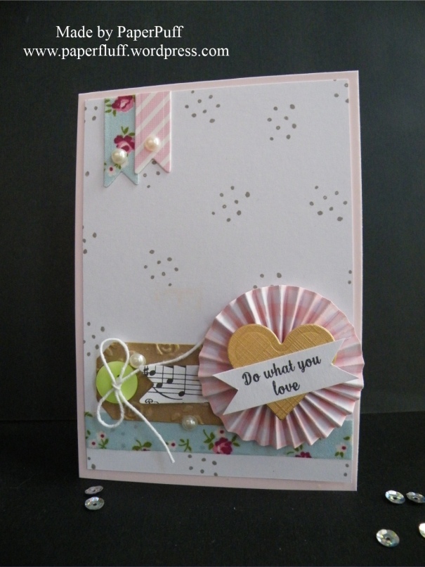
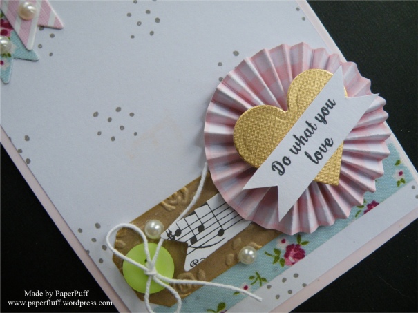
And here is the card I mentioned. A sneeze of embellishments in a pile. Hope you like it.

embellished rosetteembellished rosette detail

Supplies: Spellbinders heart die (from a nesting set); Dreamees small dotty background stamp; Tattered Lace sentiment stamp; Hunkydory Adorable Scorable card in Pashmina; Fabric ribbon from The Works; Adhesive pearls from Poundland

Scrapbusting circles

Remember Venn Diagrams?

I am away for the weekend, so have attempted to be a grown-up and scheduled a post. Wahoo! We will see. Hopefully I won’t bring the universe to a sticky end. I might though not visit everyone or comment much, but will do my best to catch up a bit when I am back.

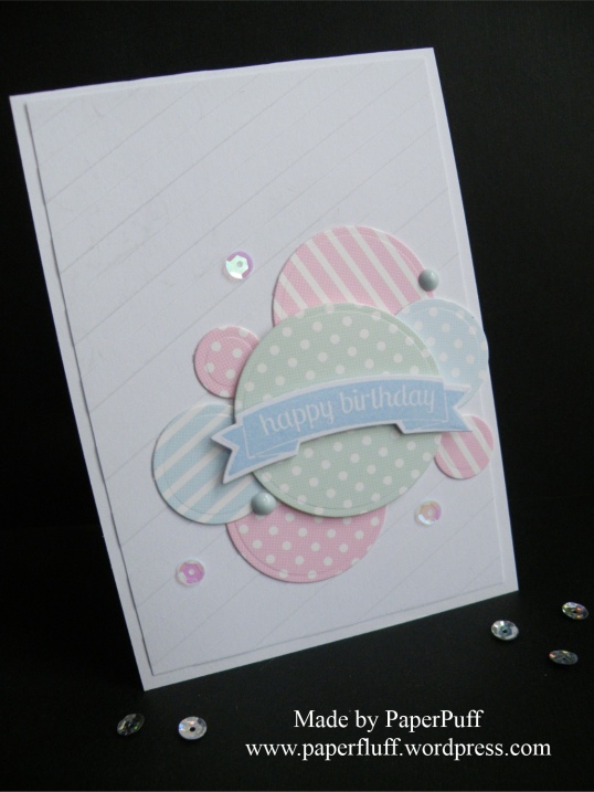
This is a very quick effort, made from scraps of cards in similar tones. I just die cut circles in four different sizes and arranged them in a pastiche of a Venn diagram onto a panel of stripe-embossed card. The embossing is not showing up great in the photo, sorry, but it is too late for me to take another picture.

hunkydory circles

The banner sentiment is on 3D foam and I added a couple of dots made with Nuvo Drops and some sequins. Because they are my new favourite thing.

Hope everyone has a great weekend and I’ll be back next week.

Supplies: coloured cardstock from Hunkydory Adorable Scorable; Tonic Nuvo Drops; Teresa Collins Modern Stripe embossing folder


Best of three…

Well, ‘best’ three times over really!

Banners, pennants, bunting, anything flag-y really, just floats my boat. Always has. Even that rather sad, dusty bunting that is brought out for shows and sales in musty church halls, still makes me smile. I guess the phrase ‘put out the flags’ is close to my happy place. Pull out a pennant, finagle a flag, bang out some bunting and you get my vote.

So, three cards, made with the same stamp and die set. Again, clean and simple in design, but I think the product suits the style. Hopefully!

One general thank you:

best of three 1

Another a bit more girlie:

best of three 2

The final one was meant to be more gender neutral. But I couldn’t resist a few sequins! Tsk!

best of three 3

Supplies: Concord & 9th Best Banners stamps and dies; Crafter’s Companion Elegant Snowfall embossing folder; Altenew Coral Berry ink; Hunkydory Adorable Scorable card in Pashmina (the pink); Create and Craft gold linen effect card


Fully loaded!

Why time spent watching YouTube is never wasted….

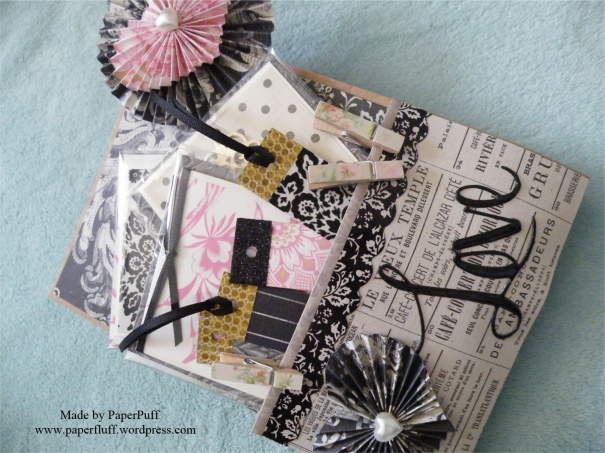
Without even trying, I somehow came across a video of a loaded pocket (I think they are also called loaded envelopes). I had never heard of these before so obviously had to check it out. Whoa! Why has the universe kept these from me up until now?! I watched a second video, then I got stuck in. If anyone else has been similarly unaware, they are basically made with either a gift bag, or a US style lunch bag. You add extra pockets and then load them up with goodies.

loaded pocket 1loaded pocket 2

This one is for my sister and contains bits and pieces I either know she needs, or can use, plus a bit of fun too. I chose a paper pad that I have had for years but will be to her taste, and added in a bit of Anna Griffin. I made a few quick note cards and then the envelopes from patterned paper, plus some circular seals. Also some slim gift tags as she often makes jewellery for her friends. The mini pegs were easy to cover with scraps of paper, and the fridge magnets are punched circles of more paper scraps glued into bottle caps and then a dome sticker over the top. I put a double layer of magnetic tape on the back as the grab was a bit feeble! I think they are still more decorative than useful but what the heck.

This slideshow requires JavaScript.

I made the rosette thingie (sorry, I have no clue what it is actually called) with an embossing board that came free with a magazine recently. Its purpose is purely decorative and I think it was a bit of a waste of time to be honest. I had no instructions, so winged it to make the support stick. A straw was the right thickness but too weak, so I strengthened it by gluing a kebab stick inside before covering it with paper and fastening to the header piece. All a bit of a faff, really.

Also going in are some craft items, but there is no need to take pictures of them, and a big bar of chocolate. Just because.

You can get a LOT of stuff into one of these and making it and the various elements was fun. It could easily be used to give different small gifts – maybe pampering goodies, flower or vegetable seeds, stationery, herbs and spices or cake decorating supplies. Anything really. And again, the best bit is the feel of the stuffed pocket and the rustling noise. Heaven!


Countdown to Easter: Eggsbox, but no games

Making a mountain out of mini eggs

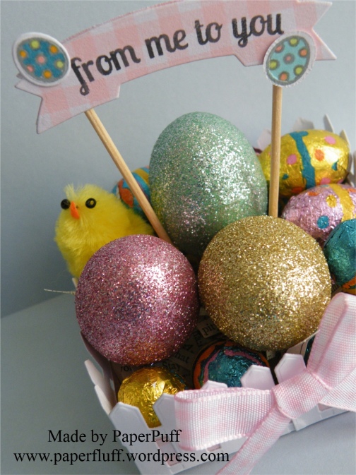
Easter eggs are not just for kids, or at least not as far as I am concerned. I like to gift a few mini eggs to friends and family too. But handing over a rather dull net of chocolate is, well, a bit humdrum, so usually I try to gussie them up a bit.

In previous years I have made little ‘shopping bags’ and folded pouches but I thought it was time to try something different. This presentation is not 100% successful. It is a bit wobbly and needs to go into a flat bottom cello bag for transportation (as in to the recipient, not to a penal colony). Also I am not wild about the foil wrapping on the eggs. It is a bit busy for my tastes but that is how they come. The hard candy shell eggs would have been better visually, but obviously hygiene prohibits the use of unwrapped items. I don’t think anyone would like a mouthful of glitter along with their chocolate. Or indeed a little bit of Riley now that we are in moulting season!

Still, the idea is ok, I think. I just made a quick box base from double sided gingham card and added a layer of with shredded paper. Shakespeare, in case the recipient should also fancy a jigsaw puzzle and some light reading. The outside is covered with multiple cuts of a picket fence die that was free with issue 144 of Papercraft Essentials magazine. Good free stuff!! Then I filled the box with some polystyrene eggs (from The Works) that had been covered in Martha Stewart glitter, one of my sadly deformed chicks and as many mini eggs as seemed feasible. Think of loading to the max a salad bowl, or a skip, whichever you can best identify with.

The final touch is a banner made with Clearly Besotted Mini Banners stamps and die. I cut the shape twice – once around the stamped image and once from plain gingham cardstock. I used red liner tape to fix an couple of cocktail sticks to the back of the stamped image and then 3D foam to cover the workings with the second die cut. A couple of Lawn Fawn Hoppy Easter eggs were hanging around so they got used too.

eggsbox1eggsbox3eggsbox2eggsbox4

Having stared at chocolate so much I am now off to eat some!