Colourful cards for men

Because not all cards for men have to be navy or brown….

I have to confess to a crime against craft. This week, whilst once again braving Stash Mountain, I came across a couple of sets of dies I had never used. Actually I have quite a few sets like that, but these ones I had also forgotten about. Tsk! I believe I may have mentioned this before, but the rule is, in order not to further upset the Gods of Craft, once such items are discovered, you gotta make something.

These are simple silhouette dies, all of a sporting ilk. I seem to remember they were a bargain, hence the purchase. Also we have quite a few ‘young men’ (translate as ‘significantly younger than us‘) in our family and I am just never prepared with cards to give them. A bit rubbish really, considering how much kit I have to hand. But stuff for younger people seems to date so fast. The ‘technology’ that was a feature of card toppers I bought, say, five years ago now probably looks to them like it might have been used to steer a tall ship in the 1800s. But hey, a shadow remains constant. Well, no, not at all really, always changing in fact…but last time I checked we all still had one…unless you live in Britain, with no sunshine…and I think there was an issue with Peter Pan…heck this is not going well at all…

Ahem. Let’s get this back on track. Anyone want to see a card? I decided to go bright, and bright-ish for these. Why not? Colour is fun and silhouettes lend themselves to a splosh of the primaries.

For the first card I used the basketball player and three different splat stamps in the primary colours. I was OK with it but though it just needed a little more, so stencilled some grey spots at the top for a bit more interest. I also stamped splats onto the envelope and one behind the greeting on the inside. In the photos the red looks a bit pinkish. It isn’t though!

sporting silhouettes basketball 1sporting silhouettes basketball 2

For the second I was considering doing pretty much the same, but in slightly softer tones and with a footballer (soccer player, to my North American pals). But recently I have seen a few examples of cards with a partial circle cut out at the edge and thought this might be fun for a change. Because the black layer looked a little austere just left plain I also used my Halftone stencil, this time with embossing ink (Versamark) and clear embossing powder. This gives it a bit of texture without (hopefully) being too girlie. Again I decorated the envelope a bit. Well, why not?

sporting silhouettes footie 1sporting silhouettes footie 2

I still have tennis, rugby and golfer dies to play with! I will probably make at least one blue or brown card. Ah well.

Supplies: Trimcraft Sporting Silhouettes dies; Altenew Birthday Greeting and A Splash of Color stamps, Halftone stencil


When the caffeine is taken away…

Yesterday I had zero caffeine. By choice, not some horrible deprivation torture inflicted by a heartless monger of alternative hot drinks. I don’t drink much – usually just one or two mugs in the morning and that is it. Rarely past noon (that is 12PM lunchtime in the afternoon to some TV presenters) as I am a serial rubbish sleeper so why throw another obstacle into the mix? But last night despite being a caffeine free zone I just couldn’t nod off and eventually got up and made a card. And, well, as you can see, I was perhaps a little preoccupied…

Coffee cardcoffee card detail

I wonder what was on my mind?!

I wanted to use some coffee beans in the photo but there are none in the house. A pile of instant coffee is not too appealing. Galaxy Counters are as close as I could get! It’s OK, they have already gone to a good home…

Supplies: Clearly Besotted Warm Wishes stamps and dies; Altenew Coffee Talk stamps; Hunkydory Adorable Scorable spotty and striped card; The Works stitched rectangle nesting dies


Ombre stamping

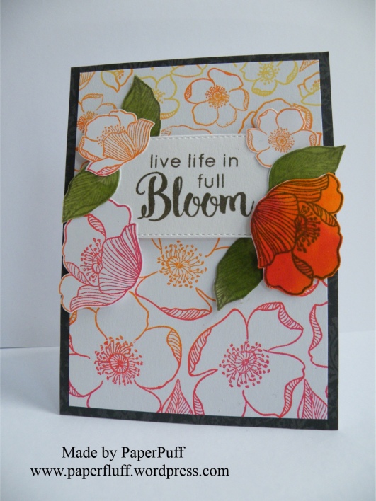
Just a post to share a card. No ranting today! This set of stamps is called ‘Adore You’. The feeling is mutual. There are so many differently sized flowers and leaves, and they are kind of retro, I think.

Last night I had an inkling to make a sort of ombre stamped effect, and also to have the flowers roughly decreasing in size as I stamped from bottom to top of the card. I found it easier to work this way to make sure I had the space to use the larger blooms. Knowing me, if I had stamped from top to bottom I would have run out of card before I got to the feature flowers. A bit like telling a joke but starting at the punch line…

Rather than using lots of small ink pads, which would have been a faff, I had a ‘I think I may have something in the back’ kind of moment. Like in an old shoe shop, not like a Brutus and Caesar showdown. And guess what? I found a very ancient Kaleidacolor Rainbow ink pad in shades from orange through to red, which was exactly what I wanted. And even though it is at least 14 years old, it still is totally fine and juicy with ink. Now that is a good product!! The various ink pads are separate when closed (to stop them mixing or contaminating each other) but you can slide them together to make one continuous ombre ink pad. Genius!

I used a dark grey mat as a contrast for all the red and orange. And although I know nobody in the industry reads this, could I still put out a plea for a decent multipack of grey card? Pretty please? It is so difficult to find, especially a really nice charcoal. Also, patterned, and self-patterned greys too, please, whilst you are not here anyway! If any other crafters know where I can get some please let me know in the comments?!

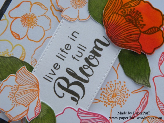
I used Altenew Lava Rock ink to stamp the sentiment (from Dahlia Blossoms stamp set) and a stitched rectangle popped up on 3D foam. Now I could well have finished here. It was a nice enough card, but I decided to take the sentiment rather literally. So, a bit more stamping and fussy cutting and I had some extra blooms. Then I decided I wanted one full-on coloured flower, but once that was on there I needed some balance, hence the green leaves. Initially they were just stamped outlines in pale green, but something jarred so they became full-on leafy. Luckily bed time came along to stop me from further fiddling!

adore you ombreadore you ombre detail

Supplies: Altenew Adore you and Dahlia Blossoms stamp sets; Kaleidacolor Rainbow ink pad in Desert Heat; Altenew inks in Lava Rock, Frayed Leaf and Forest Glades; The Works stitched rectangle dies


A problem with time

Early warning, this is a post with a tiny little rant. And a card, of course, so you can just skip to the pictures if you want! Well obviously you can do that anyway….!

So, the rant. Let’s start it with a question, in case I am completely out of order here and should be told to button it. Have the rules about telling the time changed? Has there been a vote in Parliament that didn’t make it onto the TV news, or wormed its way into any conversation I have had recently? I ask the question because there is precedent here. Usually ‘Pacific’ is the name of an ocean, we know that. But some people got ‘Pacific’ and ‘specific’ confused, often. Then somehow, over time, all those muddles became one big puddle (no, wait, that’s a different ocean) and now it seems more generally accepted that swapping the two happens, at least colloquially. Interesting that a word indicating the vastness of the seas is used as an alternative for a word meant to drill something down, to identify the particular. Go figure.

Anyway, back to the time telling problem. Recently I have become aware of a new way of doing it. On TV, in conversation and out there on the internet. Sorry if the language offends you as much as it does me, but I have to repeat it so you know what I mean. Brace yourself, here goes. Last week a TV presenter said, three times within a few sentences “2.30AM in the morning”! I know. I will was my mouth out with soap later. Or maybe just give my keyboard a rinse?

He was not the first, and of course since then I have seen and heard it so many more times. But why? Why the “AM” and the “in the morning”? We all know either one is fine and we don’t need them both, but apparently now we cannot be trusted, or are considered too lazy to understand on our own and have to have it double-defined!

So, before I write to the Queen, I just thought I would ask if the rules of time have been changed?

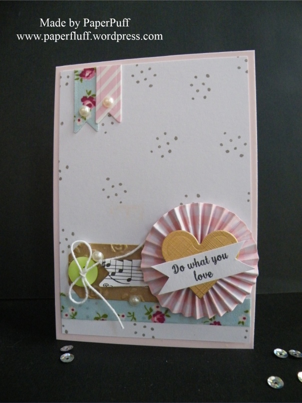
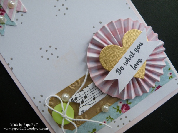
And here is the card I mentioned. A sneeze of embellishments in a pile. Hope you like it.

embellished rosetteembellished rosette detail

Supplies: Spellbinders heart die (from a nesting set); Dreamees small dotty background stamp; Tattered Lace sentiment stamp; Hunkydory Adorable Scorable card in Pashmina; Fabric ribbon from The Works; Adhesive pearls from Poundland

Scrapbusting circles

Remember Venn Diagrams?

I am away for the weekend, so have attempted to be a grown-up and scheduled a post. Wahoo! We will see. Hopefully I won’t bring the universe to a sticky end. I might though not visit everyone or comment much, but will do my best to catch up a bit when I am back.

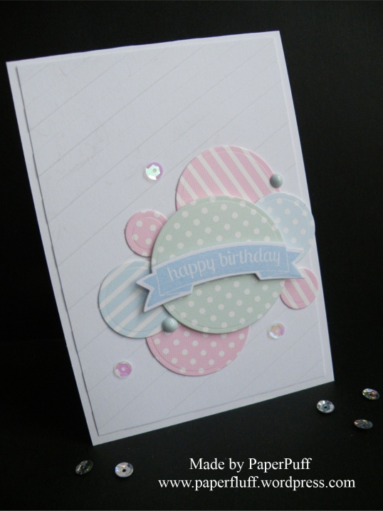
This is a very quick effort, made from scraps of cards in similar tones. I just die cut circles in four different sizes and arranged them in a pastiche of a Venn diagram onto a panel of stripe-embossed card. The embossing is not showing up great in the photo, sorry, but it is too late for me to take another picture.

hunkydory circles

The banner sentiment is on 3D foam and I added a couple of dots made with Nuvo Drops and some sequins. Because they are my new favourite thing.

Hope everyone has a great weekend and I’ll be back next week.

Supplies: coloured cardstock from Hunkydory Adorable Scorable; Tonic Nuvo Drops; Teresa Collins Modern Stripe embossing folder


Best of three…

Well, ‘best’ three times over really!

Banners, pennants, bunting, anything flag-y really, just floats my boat. Always has. Even that rather sad, dusty bunting that is brought out for shows and sales in musty church halls, still makes me smile. I guess the phrase ‘put out the flags’ is close to my happy place. Pull out a pennant, finagle a flag, bang out some bunting and you get my vote.

So, three cards, made with the same stamp and die set. Again, clean and simple in design, but I think the product suits the style. Hopefully!

One general thank you:

best of three 1

Another a bit more girlie:

best of three 2

The final one was meant to be more gender neutral. But I couldn’t resist a few sequins! Tsk!

best of three 3

Supplies: Concord & 9th Best Banners stamps and dies; Crafter’s Companion Elegant Snowfall embossing folder; Altenew Coral Berry ink; Hunkydory Adorable Scorable card in Pashmina (the pink); Create and Craft gold linen effect card


The kindness and genius of Cobs

Some of you may remember that I mentioned a while ago that my mother had broken her ankle. Cobs, from The Cobweborium Emporium made her a get well card. You might have already seen the card on Cobs’ blog, but if not, or if you are not familiar with Cobs, go see her as she is amazingly creative but also interesting and very funny! Now I wanted to share the card here too (and I did check with Cobs that it was ok), but unfortunately the photos I took at the time were rubbish, so I had to wait until I could take some better ones.

This card has everything you could wish for. It uses gorgeous papers, it is feminine and pretty, it has humour and wit but most of all it is beautifully made and made by someone with a beautiful heart.

Prepare to admire, and to snigger!

This slideshow requires JavaScript.

Isn’t it genius? We all had a good laugh, as well as drooling over the fabulous handiwork. So thanks Cobs, for your kindness and your creativity, and for being so bloomin’ lovely!


Still Stencilling….

Well, it was just sitting there, winking at me…

Another card made with my Altenew Halftone stencil. This time I have opted for a softer look, so just used two shades of grey ink (Evening Gray and Morning Frost) in a fuzzy edged (technical term!) vague circle. I then stamped my flowers and leaves in a darker grey (Moon Rock), fussy cut them and spent a small eternity faffing about with their placement. Ho hum. Some of the elements were popped up on 3D foam. Oh and UK shoppers, I found a great bargain pack of large foam squares and a big roll of foam in Poundland last week. Please forgive my ignorance but I honestly did not know that everything in that shop costs £1.00!! I kept looking for prices….But anyway, it seems like a good deal to me so thought I would mention it.

Once I had the card assembled I decided I wanted to add the tiny text greeting. I wasn’t brave enough to stamp directly onto the more-or-less finished project so chickened out. Stupid, really, because if it had gone wrong I could still have covered it over and ended up with the same card as I have here. Duh!

A few little blobs of Nuvo Jewel drops and we are good to go. I like the sentiment because it can cover a lot of occasions, either happy or not so much.

adore you cardadore you card detail

Supplies: Altenew Halftone Stencil, Adore You stamps and Warm Gray mini ink cubes set; Tonic Nuvo Jewel Drops in Pale Periwinkle; Hunkydory Adorable Scorable card (the pinkish lilac)

Smugglers, baking and boot camp

TiVo, get your act together!

I have to get this one off my chest. Has anyone else ever felt insulted by the ‘suggested recordings’ choices of their TiVo box? The TiVo has only been installed for a couple of years, and the instruction manual was never read because the gizmo worked and there are many more fun things to do with an afternoon. So the fact that there were suggested recordings at all, was something of a surprise. At first I thought it rather sweet that the blinking box in the corner would think of you throughout the day, get to know you a little and consider what TV treats you might like to enjoy later. Even going ‘off piste’ a bit and perhaps selecting something you may not have considered for yourself, but you end up loving. Similar to being given olives to try again, because although you claim not to like them, you like salty things, for example.

In the ‘getting to know you’ stage the suggested programmes were baffling. But early on in a relationship you can easily get the wrong signals, or send mixed messages. So, it proffered the local news programmes, and the BBC News, and the ITV News…. Well, news is fine, but watching it back at a later date is generally not so interesting. Really I have no idea how these things work but figured it would take time to somehow recognise what was watched and build a kind of profile. But then the random selections started to kick in. I can‘t remember specifically what, but they were not impressive.

Why wasn’t it trying harder? Why was it recording shows about border control and smugglers when such programmes were never actually watched, and should surely never be part of the viewing profile?

Then the ‘thumbs’ were discovered. Yes, perhaps this should have happened earlier. For anyone who doesn’t know, you have a green ‘thumbs up’ to say you like a programme, and a red ‘thumbs down’ to show your displeasure. You can hit the button up to three times, presumably to indicate your strength of feeling either way. Now, I get why up to three thumbs-worth of happy viewing might be useful information: I hope that if there was a recording clash between a one-thumb and a three-thumb the lovely considerate box would prioritise. This is an optimistic theory, not yet tested.

But why bother giving any more than one thumb of disapproval? Surely the TiVo is not going to think ‘Hmmn, well, there is very little of interest at the moment, so I’ll just record a single-thumbs-down programme. Can’t sit here doing nothing can I?’ Well, yes actually, you can. If you can’t record something good, don’t bother recording anything at all…

In an effort to train the beast, every time the TiVo is caught red handed i.e. recording something undesirable, the red thumb is pushed three times, still with little idea of why three is necessary but we are sending a clear message here. Same if it does good, although sadly this is less often. So now the on-screen TV guide has more up and down thumbs than a busy day at the Colosseum.

Today, late morning, the box pinged up a message to say it wanted to switch from the current programme (you know, the one you have actually chosen to watch) and record Mary Berry doing some cooking instead. Interesting. Not the choice of programme – for once it was a good choice – but that meant it was sneakily off recording another couple of shows, because it can only record three things if you are watching one of them. On further investigation these turned out to be Police Interceptors (or something like that) and Teenage Mutant Ninja Turtles. Excuse me?? I honestly don’t think ANY of the viewing history would suggest these as likely to meet with approval. Knowledge of the Ninjas is sketchy, but a programme about the real Donatello or Raphael would stand a better chance!

I have just deleted more suggestions of yet more border control programmes, ones about sheriffs and debt collectors, gadget reviews, and a marriage boot camp, all of which would never have been watched. This feels more like a marriage of convenience, or of one where apathy has taken over. Like those who shop for their spouse’s or partner’s gift in the last hour on Christmas Eve. Just get something, no matter what. Who cares if it is the wrong size and wrong colour? It’s the thought that counts right?

Wrong, Mr TiVo, wrong.

Neither of these cards are for you. We are not friends and you are not awesome.

halftone and super scripthalftone super script 2

I have used current stash from Altenew plus a guilty purchase of a stencil. It cost under a fiver so I don’t feel too bad. Sometimes you just need something new to freshen things up a bit. These cards are very similar to one of the marketing shots, but it is kind of an obvious thing to do and I was just itching to use it! I blended three different colours of Altenew inks onto my base card, then stamped and die cut the Super Script words and cut out the Label Love sentiment. I love the look of the spotty symmetry!


Mother’s Day Cards

Either late, or early depending on where you live!

These are the cards I made for Mother’s Day this year. I waited until after the day as my mother reads all my blog posts. She also still watches to make sure I cross the road safely, and yet this is something I have been accomplishing without incident for years…

For the first I used some Tonic dies I have had for a long time. They are very adaptable as you can cut the hearts out completely or leave them in the card. I decided to make a kind of layered window effect, so the top layer has the larger heart cut into it and the second layer has the smaller sentiment. It doesn’t show up too successfully in my pictures, I’m afraid! As I was going for an all cream card I thought I needed a bit more interested so rummaged through my embossing folder trough and selected one from Sizzix that has some pretty details but is not an all-over pattern. Sometimes a little bit of blank space is good. I tied the ribbon knot and thought I had finished, but then changed my mind and added the trail of pearls too.

mothers day heartmothers day heart 2mothers day floral muse

The second card is made with Dovecraft Floral Muse papers. I know I have used these a few times now, but they are my current ’go to’ when really pretty and feminine patterns are required. I was inspired by something I saw on Pinterest, but I changed it up a bit and added several details of my own. The various layers of papers were edged with Vintage Photo Distress Ink to give them some definition. Butterflies were fussy cut from one of the pages in the pad and then I spent ages trying to find a good match in my ink colours for the sentiment. Many a green was tried and tossed and finally I went with Brilliance Pearlescent Beige. A few more pearls again (well, why not?) and I was happy. Oh, and another doily from my doily mountain has been used….

Supplies: Dovecraft Floral Muse paper pad; Clearly Besotted Mini Banner stamp and die; Tonic On Mother’s Day Affections Insert die set; Sizzix embossing folder (it has no name on it!); string pearls from The Ribbon Room and individual pearls from Dreamees