When the caffeine is taken away…

Yesterday I had zero caffeine. By choice, not some horrible deprivation torture inflicted by a heartless monger of alternative hot drinks. I don’t drink much – usually just one or two mugs in the morning and that is it. Rarely past noon (that is 12PM lunchtime in the afternoon to some TV presenters) as I am a serial rubbish sleeper so why throw another obstacle into the mix? But last night despite being a caffeine free zone I just couldn’t nod off and eventually got up and made a card. And, well, as you can see, I was perhaps a little preoccupied…

Coffee cardcoffee card detail

I wonder what was on my mind?!

I wanted to use some coffee beans in the photo but there are none in the house. A pile of instant coffee is not too appealing. Galaxy Counters are as close as I could get! It’s OK, they have already gone to a good home…

Supplies: Clearly Besotted Warm Wishes stamps and dies; Altenew Coffee Talk stamps; Hunkydory Adorable Scorable spotty and striped card; The Works stitched rectangle nesting dies


Scrapbusting circles

Remember Venn Diagrams?

I am away for the weekend, so have attempted to be a grown-up and scheduled a post. Wahoo! We will see. Hopefully I won’t bring the universe to a sticky end. I might though not visit everyone or comment much, but will do my best to catch up a bit when I am back.

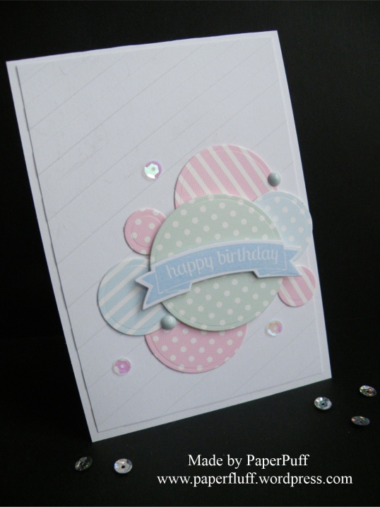
This is a very quick effort, made from scraps of cards in similar tones. I just die cut circles in four different sizes and arranged them in a pastiche of a Venn diagram onto a panel of stripe-embossed card. The embossing is not showing up great in the photo, sorry, but it is too late for me to take another picture.

hunkydory circles

The banner sentiment is on 3D foam and I added a couple of dots made with Nuvo Drops and some sequins. Because they are my new favourite thing.

Hope everyone has a great weekend and I’ll be back next week.

Supplies: coloured cardstock from Hunkydory Adorable Scorable; Tonic Nuvo Drops; Teresa Collins Modern Stripe embossing folder


Still Stencilling….

Well, it was just sitting there, winking at me…

Another card made with my Altenew Halftone stencil. This time I have opted for a softer look, so just used two shades of grey ink (Evening Gray and Morning Frost) in a fuzzy edged (technical term!) vague circle. I then stamped my flowers and leaves in a darker grey (Moon Rock), fussy cut them and spent a small eternity faffing about with their placement. Ho hum. Some of the elements were popped up on 3D foam. Oh and UK shoppers, I found a great bargain pack of large foam squares and a big roll of foam in Poundland last week. Please forgive my ignorance but I honestly did not know that everything in that shop costs £1.00!! I kept looking for prices….But anyway, it seems like a good deal to me so thought I would mention it.

Once I had the card assembled I decided I wanted to add the tiny text greeting. I wasn’t brave enough to stamp directly onto the more-or-less finished project so chickened out. Stupid, really, because if it had gone wrong I could still have covered it over and ended up with the same card as I have here. Duh!

A few little blobs of Nuvo Jewel drops and we are good to go. I like the sentiment because it can cover a lot of occasions, either happy or not so much.

adore you cardadore you card detail

Supplies: Altenew Halftone Stencil, Adore You stamps and Warm Gray mini ink cubes set; Tonic Nuvo Jewel Drops in Pale Periwinkle; Hunkydory Adorable Scorable card (the pinkish lilac)

The Jaws Legacy

I refer to the famous and fabulous movie, Jaws, of course. I saw it at the cinema, when I was rather younger than the age group the film censor board had set, but you know how it is. I was with my sister who had seen it before and promised to warn me of the bits where I ‘shouldn’t look’, seeing as I was, and still am, very squeamish. She did her job just fine, but even so, well, let’s just say it affected me. I already had a recurring dream about crocodiles to deal with, now I had lurid visuals of shark attacks and that menacing music to throw in too. I absolutely kid you not, but a few weeks after seeing the movie I was standing at the kitchen sink and out of the corner of my eye, just for a split second, I thought I saw a shark on the kitchen floor….and I actually jumped…. Imagination is sometimes a scary thing!

Of course I have rewatched the movie many times since then, and seen all the sequels too ( the fourth was hilarious), but there are still bits where I have to look away.

I realised whilst watching TV the other day, there was what should have been an idyllic scenario. A beautiful day: azure sky, sapphire sea, and a small boat bobbing up and down. A handsome couple are aboard, chatting lazily about something inconsequential. And whilst doing so, the chap dangles his left foot into the water. Instantly, inner alarm bells sound. I think ’NOOOO! STOP! What are you THINKING?!’ I can’t help it. Instinctively I imagine he, and everyone else that languidly dips a limb into the ocean, is being a stark raving idiot. Don’t they KNOW what might be down there, waiting? Don’t they want to keep all their limbs intact? Or have they maybe worked out which is their least favourite, the arm or leg they don’t mind sacrificing, just to cool down a bit?

Don’t get me wrong – I am aware this is a totally insane reaction on my part. I know we are far more danger to sharks than they are to us, and that instances of attack are rare. I admire the stark beauty and efficiency of sharks. But, deep down, Jaws planted that fear, that terrible possibility… I mean, if I thought I was in danger whilst peeling spuds in the kitchen, clearly we are not dealing with rationality here. And that, I have come to conclude, is the Jaws Legacy. Maybe I can try suing for damages?

So here we have a card, with a flamingo staying safely on dry land. He’s not daft. Or maybe he has seen the movie too?

flamingo-frame

Supplies: Hunkydory Flamingo Party stamp set; Altenew and Memento inks; various alchohol markers

Yellow Fever

Just a quick post. Here are two more cards I made this week. It would seem I have yellow fever. Normally I don’t ‘do’ yellow much – although we did go through a small fortune and a bajillion tester pots trying to find the ‘right’ yellow for the hallway and stairs many years ago. To be honest we could have painted the whole space in the purchased tester pots, there were that many. No yellow went untried. Maybe this, or custard tarts, has put me off….

But recently the yellow has been beckoning. Thoughts of, and hopes for spring, I guess. Or maybe I just want to eat a pound of butter. Unlikely. Let’s go with spring.

spring-card-pair

Anyway, two cards, both stamped, one entirely flat, the other almost so. I couldn’t resist adding a couple of Nuvo Jewel Drops as they are so shiny and translucent and yummy.

an-spring-dahlia-blossomsan-spring-tulip

Supplies: Altenew Tulip and Dahlia Blossom stamps sets and various Altenew inks; Tonic Nuvo Jewel Drops; Hunkydory Adorable Scorable yellow card


Three degrees

deer-family-multi

Whilst rummaging in the craft room at the weekend I came across some snowy acetate I bought a couple of years ago. Nothing like rediscovering an old friend, is there? I decided to give it a bit of a workout. Also, those who read my posts regularly may remember that a vital Christmas die went missing a few weeks ago. The guilty party is either the cat or a poltergeist, because the die was returned last week. Left in the middle of the living room floor. Hmmm. I am pretty sure forensic testing would detect kitty DNA, or at least tuna… Anyway, it is back so Christmas is no longer cancelled.

To the cards, then. The first ‘degree’ of difficulty, is well, not in the least bit difficult really. I used the Deer Family die as it is, plus a banner greeting. A square of the snowy acetate was layered over royal blue card for the background sky, 3D foam and done. Total absolute beginner level. I think it would be good for a male Christmas card, maybe?

deer-family-simple

For the second degree, well there was a bit more thinking required for the composition, but once that was done it was simple to put together. Here I have used acetate to make the base card: it is sturdy enough to stand up with no problem. This time for the Deer Family I cut away the circular dome, so they are just silhouettes on a strip of card. I stamped and embossed the sentiment onto vellum and then wrapped the vellum around the layer with the Tree Landscape and adhered this to the piece with the deer. For acetate cards you need to tidy up the inside too, so nobody sees the gluey mess that is your shame. Just cover it up with another bit of card and nothing to see here! You also need somewhere to write. Well, unless you don’t like the recipient enough to bother, but then why are you sending the card?! My top tip for this (only thought of it today) is to flip the card over so the front is facing down on your work surface. Now you can easily layer a panel to line up with whatever is on the card front. Then you can turn the card the right way up, open it and align the interior panel perfectly with the one you have stuck to the very back of the card. Hurrah!

deer-family-acetate

Now, the third degree of difficulty. I could have done with a lie down in a darkened room after this. All the dies are from different companies, so not intended to be used together but I had in my head that a diorama style would be fun. Fun for who, exactly?? I jest. It was a good thing to try and I felt I had achieved something. I’m not going to explain how I did it, because part-way in I had a bit of an epiphany and may have come up with a better and easier method. I will test it out and share if it works.

deer-3d

I do have a question to throw out there though. I want a detail gold embossing powder that is a really rich, bright, warm gold. The one I used on the first card here is, to be fair, at least 12 years old, but it is too ‘muddy’. Also, it MUST be a detail powder. Anyone got any recommendations? Oh and acetate, nightmare to photograph. I think you can see the roof of the house across the road in one of these shots and our guttering in another….how picturesque!

Long list of supplies today:

Clearly Besotted Tree Landscape and Mini Basic Banners dies; Lawn Fawn Village Border die; Memory Box Deer Family Circle die; X-Cut Rectangle Parenthesis Large dies; The Ton Holiday Lyrics (Dashing Through the Snow); Clearly Besotted Mini Basic Banners III stamps; Hunkydory snowy acetate. Rest of supplies from stash.


How not to do this

Today I decided to try something new. I saw a card that had been made with a word die, with ¾ of the word standing free as a header at the top. I have some patterned header dies specifically for this purpose, and I love the look of them. I thought today I would try it out with dies not designed for the task. The results are not perfect, but I’m showing you what happened in case you try it too – my mistakes might save you a bit of time!

I attempted two ways: one with a word die and one with individual letters.

The basic principle is that you will be making a tent fold (or top folding) card. You place the die(s) in the centre, but you don’t put the lower portion of the die(s) between the cutting plates. So you are kind of hanging it off the edge really and only cutting the top part of the letters or words.

Here is where I made rookie mistake number one. For some reason best left between me and my maths teacher, I thought I would have to make the highest cutting point (so in these cards it is the ‘’l’ in celebrate) fall about where I wanted to fold. Duh! Obviously, obviously not. I now have a stunted card.

What you actually need to do is:

Cut your base piece of card to size. Say you have a strip which measures 10.5 x 30cm, your fold line (don’t score it yet though!) will be at 15cm.

This is the tricky bit. I think some dies and letters will work better than others. Position your dies(s) so that at least 2/3 of the die is above your (imagined) fold line, but you need to consider the shapes a bit too. Remember the bottom part of the letter will not be defined at all, so it needs to be obvious from the free-standing part what the letter actually is. For example in the WISH card here, I should have moved the S higher up. I thought wonky would be fun, but once cut and folded I just had a strange hook shape, like a flipped question mark! All the other letters were fine. I fixed it by cutting the letters again and sticking them over the top, which is not quite what I intended and in the picture it does look a bit like that was all I did but at least now I know for next time. For the ‘celebrate’ card it didn’t matter too much, because the die on its own is not clear anyway and you really need the stamp too.

Run it through your die cutter, as above, making sure the plates don’t cover the lower part of the letters.

Remove your dies and now you crease and fold at your centre line. Make sure you score in between letters too.

And done. Now you just need to decorate!

What else did I learn? That the single letter dies should have been closer together. Perhaps I should have cut them individually and I might have spaced them better.

Both methods work ok – it just depends on what you have to hand.

You have a bit of wiggle room if you need to move your centre fold a millimetre or two once you have cut the dies, just trim the short edges of your card accordingly.

Oh yeah, and my maths is still rubbish, but I didn’t really need to be reminded of that….

Supplies: Hunkydory Adorable Scorable card; Altenew Super Script die and stamp; Xcut Wedding Alphabet & Numbers dies


When men make you hit the bottle….

By which I mean those times when you need a present for a chap. Maybe you don’t know them that well so their favourite wine/spirit is a safe choice, or perhaps they have so much ‘stuff’ they really don’t want any more, or just because they enjoy a tipple and it would be the gift they appreciate most. Better than socks. Unless you have lovingly hand knitted them of course, which elevates their present ranking to stratospheric. For most of us then, you buy them booze. But now you have to wrap it. Options are sometimes limited. Bottle bags, readily available, but often a bit too girlie. Then you have to store them, find them when you need them, do the ‘will it take the weight’ test…. Or you can make a sturdy box if you are that way inclined. Sometimes I am. But the cardstock required can be pricey, and it takes a bit of time to make. I don’t always have that time, and I have this thing that whilst wrapping should always be totally marvellous, you don’t want to hype the gift up so much with the bells and whistles that the actual present is a let-down. You don’t want the thrill of Baby Spice on the outside to only turn into the disappointment of Old Spice on the inside, if you see what I mean? You don’t want the box to look like it might have, say, 20 year old malt whisky when you have actually bought beaujolais nouveau. Or supermarket plonk.

Anyhoo, I thought I would make some bottle tags, in advance, ready to adorn any gift bottle required. These are the first two, made with Hunkydory Gentleman’s Journey. I don’t buy kits much any more. Nothing against them, I just don’t feel I do them justice. Others produce such stunning projects and my fingers won’t do the same. But with Gentleman’s Journey I loved the kit so much as soon as I saw it, I knew I would succumb, so I waited and bought it on sale. I haven’t made much with it so far – just a couple of cards – but I thought it would lend itself to bottle tags really well.

This is the first one I did. I’m not entirely happy with it, but then I tell myself it will just be round the neck of a bottle of wine or something and, well, get a grip basically! It is a strip of the Hunkydory printed /foiled card from the kit, cut to 6.5cm wide. This is a good width for a standard wine bottle. The length of the strip is up to you. This one was 21cm (size of the card) but I trimmed a bit from the bottom to re-use. Score the long edges at 6.5cm and fold. Cut your circle to go over the neck of the bottle in the 6.5cm square you have just made. I used a Spellbinders 4cm die.

I then took a page of the horse racing image from the ‘Little Book of’ that came with the kit, trimmed it down and adhered it level with the right hand side of my tag but leaving a border top, bottom and left hand side. I then added the strip I had trimmed from the bottom earlier to cover the top cut edge. Add a topper and sentiment, overlapping the sides by quite a way. Actually I think I went too far with the oval topper and that is what is not quite right with it for me. Then I used some Card Candi.

I like the second one more. It is shorter than the first – mainly because the cat chewed on the kraft card that was my starting point so I had to cut that bit off! I used one of the inserts to cover the tag, with the square pattern at the top. And yes I know this means a bit of the wording is upside down, and I fretted about this for a few minutes and then acknowledged that it didn’t matter. One. Tiny. Bit. I covered the bottom third with a part of a page taken from the Little Book again and added a small topper on 3d foam. I cut the flag from the same sheet from the Little Book and stuck it onto some card to make it sturdier. Because it is that bit shorter, you could use it for a beer bottle as I did in the photo (mainly because I don’t actually have two wine bottles to hand!). Or swanky olive oil for a keen cook, maybe?

The beauty of these is that, if you don’t write on them, the recipient (well, their wife or girlfriend) can reuse them, like we all do with bottle bags. So it is sort of two gifts in one! And because the kit is so huge, you could rustle up a themed card to go with it.

I’m going to make a few more modern ones, and some for us womenfolk too.