When the caffeine is taken away…

Yesterday I had zero caffeine. By choice, not some horrible deprivation torture inflicted by a heartless monger of alternative hot drinks. I don’t drink much – usually just one or two mugs in the morning and that is it. Rarely past noon (that is 12PM lunchtime in the afternoon to some TV presenters) as I am a serial rubbish sleeper so why throw another obstacle into the mix? But last night despite being a caffeine free zone I just couldn’t nod off and eventually got up and made a card. And, well, as you can see, I was perhaps a little preoccupied…

Coffee cardcoffee card detail

I wonder what was on my mind?!

I wanted to use some coffee beans in the photo but there are none in the house. A pile of instant coffee is not too appealing. Galaxy Counters are as close as I could get! It’s OK, they have already gone to a good home…

Supplies: Clearly Besotted Warm Wishes stamps and dies; Altenew Coffee Talk stamps; Hunkydory Adorable Scorable spotty and striped card; The Works stitched rectangle nesting dies


Ombre stamping

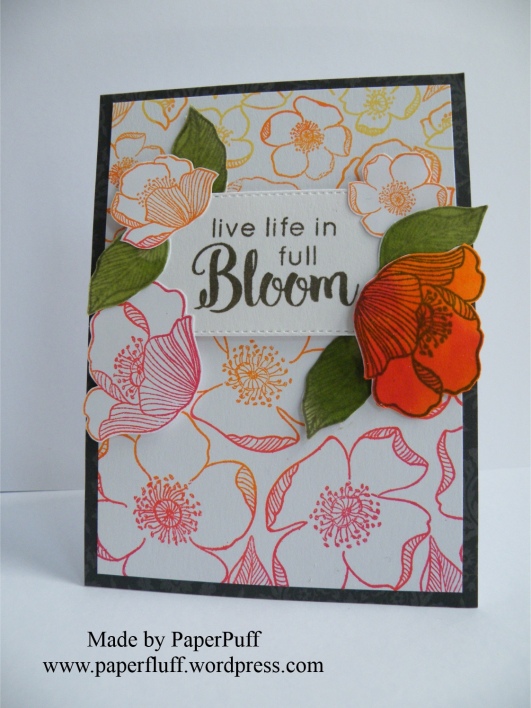
Just a post to share a card. No ranting today! This set of stamps is called ‘Adore You’. The feeling is mutual. There are so many differently sized flowers and leaves, and they are kind of retro, I think.

Last night I had an inkling to make a sort of ombre stamped effect, and also to have the flowers roughly decreasing in size as I stamped from bottom to top of the card. I found it easier to work this way to make sure I had the space to use the larger blooms. Knowing me, if I had stamped from top to bottom I would have run out of card before I got to the feature flowers. A bit like telling a joke but starting at the punch line…

Rather than using lots of small ink pads, which would have been a faff, I had a ‘I think I may have something in the back’ kind of moment. Like in an old shoe shop, not like a Brutus and Caesar showdown. And guess what? I found a very ancient Kaleidacolor Rainbow ink pad in shades from orange through to red, which was exactly what I wanted. And even though it is at least 14 years old, it still is totally fine and juicy with ink. Now that is a good product!! The various ink pads are separate when closed (to stop them mixing or contaminating each other) but you can slide them together to make one continuous ombre ink pad. Genius!

I used a dark grey mat as a contrast for all the red and orange. And although I know nobody in the industry reads this, could I still put out a plea for a decent multipack of grey card? Pretty please? It is so difficult to find, especially a really nice charcoal. Also, patterned, and self-patterned greys too, please, whilst you are not here anyway! If any other crafters know where I can get some please let me know in the comments?!

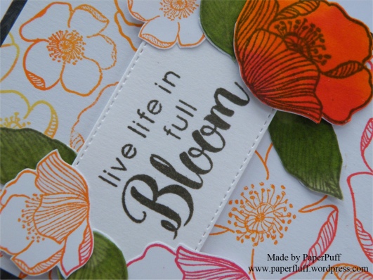
I used Altenew Lava Rock ink to stamp the sentiment (from Dahlia Blossoms stamp set) and a stitched rectangle popped up on 3D foam. Now I could well have finished here. It was a nice enough card, but I decided to take the sentiment rather literally. So, a bit more stamping and fussy cutting and I had some extra blooms. Then I decided I wanted one full-on coloured flower, but once that was on there I needed some balance, hence the green leaves. Initially they were just stamped outlines in pale green, but something jarred so they became full-on leafy. Luckily bed time came along to stop me from further fiddling!

adore you ombreadore you ombre detail

Supplies: Altenew Adore you and Dahlia Blossoms stamp sets; Kaleidacolor Rainbow ink pad in Desert Heat; Altenew inks in Lava Rock, Frayed Leaf and Forest Glades; The Works stitched rectangle dies


A problem with time

Early warning, this is a post with a tiny little rant. And a card, of course, so you can just skip to the pictures if you want! Well obviously you can do that anyway….!

So, the rant. Let’s start it with a question, in case I am completely out of order here and should be told to button it. Have the rules about telling the time changed? Has there been a vote in Parliament that didn’t make it onto the TV news, or wormed its way into any conversation I have had recently? I ask the question because there is precedent here. Usually ‘Pacific’ is the name of an ocean, we know that. But some people got ‘Pacific’ and ‘specific’ confused, often. Then somehow, over time, all those muddles became one big puddle (no, wait, that’s a different ocean) and now it seems more generally accepted that swapping the two happens, at least colloquially. Interesting that a word indicating the vastness of the seas is used as an alternative for a word meant to drill something down, to identify the particular. Go figure.

Anyway, back to the time telling problem. Recently I have become aware of a new way of doing it. On TV, in conversation and out there on the internet. Sorry if the language offends you as much as it does me, but I have to repeat it so you know what I mean. Brace yourself, here goes. Last week a TV presenter said, three times within a few sentences “2.30AM in the morning”! I know. I will was my mouth out with soap later. Or maybe just give my keyboard a rinse?

He was not the first, and of course since then I have seen and heard it so many more times. But why? Why the “AM” and the “in the morning”? We all know either one is fine and we don’t need them both, but apparently now we cannot be trusted, or are considered too lazy to understand on our own and have to have it double-defined!

So, before I write to the Queen, I just thought I would ask if the rules of time have been changed?

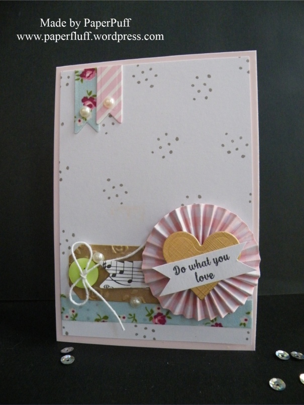
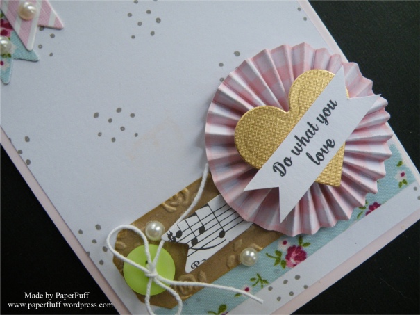
And here is the card I mentioned. A sneeze of embellishments in a pile. Hope you like it.

embellished rosetteembellished rosette detail

Supplies: Spellbinders heart die (from a nesting set); Dreamees small dotty background stamp; Tattered Lace sentiment stamp; Hunkydory Adorable Scorable card in Pashmina; Fabric ribbon from The Works; Adhesive pearls from Poundland

April Showers

How to make something seemly simple take for EVER!

Now to look at this card, you might think it was the work of a few minutes. Stamp out the umbrellas, add a bit more stamping using the colours and the sentiment, grab a band of ribbon and Robert is your father’s brother. Hell, no.

april showers

For a start, the umbrella comes in separate bits. Don’t get me wrong, I am not complaining. It is a feature of the stamp set that I really like, because there is room to play. So, I started my repeat pattern with the central umbrella, to make sure it was where I would want it. Handle first, then the canopy outline.

So far, so good. Now, each canopy, either spotted or striped, comes in 3 pieces. Again, I was happy with this because I wanted to mix it up a little, both with colour and pattern. I wasn’t confident I could stamp exactly in the right place 20 times and not fudge up though, so I decided to stamp then on scrap card and cut them out individually. Nobody say anything, OK?

Cutting curves accurately is not in my skill set. I had to re-do a few, but, eventually, I had a full cast of canopies, spotty and stripy, at my disposal. Hurrah! Assembly time!

Casual abandon is not in my skill set. Whatever arrangement I came up with, something offended me visually. Two blues too close together, yellow stripes too far apart… I decided that maybe it was because I didn’t have enough sections. Perhaps there was a basic maths principle I should use, to work out my pattern requirements?

Maths is not in my skill set. Pretty much the only thing I remember about maths is the Fibonnaci sequence and how to quickly tell if a number is divisible by 3. How often do either of those come in handy?! Unless I am trying to make small talk with two Italians whilst splitting our restaurant bill, not so much. I gave up on the maths idea. Back to winging it.

Winging it is not in my skill set. Rational thinking occasionally shows its face though. I gave up on the idea of mixing the colours and patterns and went for uniformity. So, a card which could have been relatively quick ended up taking ages. Just peachy…

Supplies: Clearly Besotted April Showers stamp set; Brilliance Pearlescent inks in Rocket Red, Sky blue and Sunflower Yellow; Memento Tuxedo Black ink; ribbon from The Ribbon Room


The Jaws Legacy

I refer to the famous and fabulous movie, Jaws, of course. I saw it at the cinema, when I was rather younger than the age group the film censor board had set, but you know how it is. I was with my sister who had seen it before and promised to warn me of the bits where I ‘shouldn’t look’, seeing as I was, and still am, very squeamish. She did her job just fine, but even so, well, let’s just say it affected me. I already had a recurring dream about crocodiles to deal with, now I had lurid visuals of shark attacks and that menacing music to throw in too. I absolutely kid you not, but a few weeks after seeing the movie I was standing at the kitchen sink and out of the corner of my eye, just for a split second, I thought I saw a shark on the kitchen floor….and I actually jumped…. Imagination is sometimes a scary thing!

Of course I have rewatched the movie many times since then, and seen all the sequels too ( the fourth was hilarious), but there are still bits where I have to look away.

I realised whilst watching TV the other day, there was what should have been an idyllic scenario. A beautiful day: azure sky, sapphire sea, and a small boat bobbing up and down. A handsome couple are aboard, chatting lazily about something inconsequential. And whilst doing so, the chap dangles his left foot into the water. Instantly, inner alarm bells sound. I think ’NOOOO! STOP! What are you THINKING?!’ I can’t help it. Instinctively I imagine he, and everyone else that languidly dips a limb into the ocean, is being a stark raving idiot. Don’t they KNOW what might be down there, waiting? Don’t they want to keep all their limbs intact? Or have they maybe worked out which is their least favourite, the arm or leg they don’t mind sacrificing, just to cool down a bit?

Don’t get me wrong – I am aware this is a totally insane reaction on my part. I know we are far more danger to sharks than they are to us, and that instances of attack are rare. I admire the stark beauty and efficiency of sharks. But, deep down, Jaws planted that fear, that terrible possibility… I mean, if I thought I was in danger whilst peeling spuds in the kitchen, clearly we are not dealing with rationality here. And that, I have come to conclude, is the Jaws Legacy. Maybe I can try suing for damages?

So here we have a card, with a flamingo staying safely on dry land. He’s not daft. Or maybe he has seen the movie too?

flamingo-frame

Supplies: Hunkydory Flamingo Party stamp set; Altenew and Memento inks; various alchohol markers

I blame Doris Day. And Julia Roberts.

Little gift bags. Don’t you love them? I do, slightly to the point of obsession, in truth. I think it is due to all those movies where you see someone out on a shopping spree. We watch a montage bit, with nods and smiles to the shop staff, an impromptu catwalk show for one and some uplifting ‘what good fun this is’ music. Then the immaculately dressed star appears tripping daintily along with an unwieldy haul of beautifully presented packages, boxes and bags.

Real life isn’t like that. Doris and Julia didn’t shop in the rain, having forgotten their umbrella, thus ending up with lank hair plastered to their heads and a whiff of damp wool or anorak about them. Or with a streaming cold that made their nose go red and render them nearly incomprehensible to the assistant. They didn’t have to lug badly made plastic carrier bags that, once stuffed with your practical purchases, weigh a ton and cut into your hands. Only you didn’t realised this was happening because your hands are so darn cold (your gloves are with your umbrella, at home, in the warm) you have lost most of the feeling anyway. Doris and Julia didn’t have to choose sensible shoes over kitten or stiletto heels because the hours of tramping the aisles or pounding the pavement would make their pretty ankles swell like swiss rolls. Theirs was a very different shopping experience, one I am yet to emulate.

Aaaaanyway, back to the reason for the rambling. I have made a simple card and gift bag using the same stamp. I have had this La Blanche stamp for years and love the fine detail of it, but am not much of a one for the traditional sunflower colours so decided to go for grey and black.

sunflower-bag-and-card-1

My fabulous WRMK Gift Bag Punch Board was used to make the bag from plain white card, which I punched and scored to see where the panels would fall, but did not assemble. This meant I knew where I needed to position the stamp to get it bang on the front. I also die cut ovals to make the handles, then a larger oval frame from black to reinforce them. And to make the bag fancier! Then I went mad and blinged up a small wooden peg with holographic gold tape from The Works. Doris and Julia don’t get all the fun!

To make the card a bit more interesting I just cut a section of the image from the bottom and layered onto black mats. An old trick but it works a treat! The oval shape for the stamped sentiment is the one I cut from the gift bag, to tie everything in, hopefully nicely. And a few pale orange Nuvo Drops for a tiny splash of colour.


3D Thursday: Brew-tea and the Box’d

Sorry, Mr Disney…..

Once upon a time, whilst foraging for craft supplies, PaperPuff came across a small cardboard curiosity. “WTH (polite version) is this?” She thought. On further tentative inspection it appeared to be a kind of favour, or gift wrap for those cute little individually packaged tea bags. The mists of wine time cleared and PaperPuff remembered the box, and how it came to be. She had seen it many moons past on Craft telly and made one quick, before she forgot about it. Then she forgot about it. Silly PaperPuff!!

tea-bag-holder-pair

Don’t you just love it when a plan falls apart?!

I honestly don’t know if these are faithful replicas made from measurements supplied, or whether I employed good old Brain to work it out. However, to be honest, some basic measuring is all we need to do. I hope I am not doing anyone an injustice.

So, I thought it might make a nice 3D Thursday project and set about re-measuring and making another. There are I believe many versions of this kind of holder out there: this one is super-simple and requires a minimal amount of tools.

If you want to have a go, here is what to do:

I used Twinings individually wrapped tea bags which measure 6.5cm wide x 7.5cm high. If yours are different you will of course need to take this into account.

1. Grab a piece of decent weight double-sided card and cut it to 8 x 25cm

2. Score this at 9, 11, 20 and 21.5cm, fold and burnish the creases. If you want you can round the corners of the top flap (the 3.5cm panel). I couldn’t find my corner rounder (I know, find one thing, lose another!!) so went for a WRMK scallop Chomp instead. I expect this too will have disappeared next time I need it.

Tip: if your card has a one-way pattern, remember that as you are basically making a wrap, at some point the pattern will be upside down. Obviously the back is the best place for this (and you can always cover it over with another panel if this bothers you)! If you make your first score at 9cm from the top of the pattern (think of it as a roll of wallpaper) this should work out fine and your top and lower flaps at the front should both be the correct way up. If your one-way pattern repeat is going to be on the inside you will need to flip this, so your first score (9cm) will be at the bottom of your piece. Or, make life easy and just choose a non-repeat patterned paper!

3. Next cut 2 pieces of card 11 x 8cm. These are going to form the pleated side sections. You can go crazy and choose another pattern here for extra interest. I did on the first holder I made (the spotty one) but figured I had enough going on already on the second one with the birds.

Score these pieces at 1.5cm, then again at 1cm intervals until you get to 9.5cm, leaving a last section of 1.5cm again.

4. Concertina fold these score lines. Add strong double-sided tape (or glue if you prefer) to the outside of the 1.5cm tabs and fix them inside the ‘wrap’. I found it easier to stick each of to the back first, then the front, and you want the raw edge (not a fold) of the 1.5cm sections to be on the inside. If you butt the pleated sections up to the score lines and the base, and just keep the sides square with your hand, it happens really easily. If this is at all confusing, look at the images below for the positioning. Much better than me trying to explain!! The slideshow I planned would have been even better, but it is refusing to work for some reason I cannot fathom.

5. To make your dividers, just cut more patterned card into 7.5 x 8cm rectangles – you will need 3 for this configuration. Slide them into your pleated sections and ba-boom, instant little pockets!

The fastening can be whatever you want. I had used baker’s twine on the first one and ribbon this time. Cut enough to wrap around and tie in a bow – I snipped a length a little under 60cm to give enough to play with and trimmed the excess. I used a die cut for one closure and fussy cut an image for the other, and punched a small hole at the bottom. The ribbon or twine was glued centrally on the top flap, close to the edge, and then fed through the hole and tied.


What did I learn second time around? Well, because my one-way pattern repeat was quite large I wasn’t happy with how it looked where the top and bottom sections met at the front, so I just cut a panel the same size from a closer pattern repeat and covered the offending top tab completely. Really, smaller, or massively larger patterns would probably be better options. The spots I chose initially were a good way to go if you want to keep it simple.

You don’t need double-sided card, it just makes it more interesting if the inside is also colourful. I want to make a stamped version too, with a teacup as the fastener, which I think will be kind of cute. Time is always an issue though!

These little pouches could be for gifts, showers, favours, or a small thank you, perhaps. You could leave out the concertina folds in the sides and just make a small unpleated section to create a simple single pocket. But something about pleated paper makes me happy…..

Supplies: both holders are made from Tilda Winterbird paper pad

Unnatural selection, and reinvention

I have had this colour scheme in my head for a few days. I wanted a limited but punchy palette, so coloured this daisy stamp in shades unnatural to its species and selectively, so petals only. The centres remain deliberately monochrome (in case anyone thinks I just gave up!), along with the rest of the card.

The bottom section is just random stamping of Altenew Freeform Greenery in black. It reminded me a bit of that 1950s black and white Homemaker china that everybody seemed to have a plate of lurking in the back of the cupboard and threw out the week before it got fashionable again.

red-daisy-1

Recently I rediscovered my Label Love stamps – hurrah! They had been missing for months but resurfaced inside (I know, don’t judge me) an embossing folder. So they get to be used again to add a bit more inky darkness.

Basically, what I have done is just repeated the design of my old faithful Peony Bouquet card (the one I use for my Gravatar) in different colours. But ‘reinvention’ sounds so much more complimentary.

Supplies: stamps are all from Altenew – Spring Daisy, Freeform Greenery and Label Love.


Getting some zzzzzs

I was going to title this post ‘Time for Z’ but I realised that would make very little sense to ‘across the pond-ers’, as you pronounce it ‘zee’ but we Brits go for ‘zed’. I’m fairly confident ‘time for zee’ would just leave a quizzical look or two (probably not the first time I have done this to you, to be fair!) whereas in the UK we would find ‘time for zed’ as slightly humorous. Hopefully. Then, you see, years ago we had a kids programme called The Magic Roundabout, featuring a moustachioed creature on a spring, whose name was Zebedee (see, see? See all the Z-based fun?) and who always said ‘time for bed’ at the end of each episode…it would have been a great joke …ok, mildly amusing…anyone fallen asleep reading this yet?! No? Good. Let’s crack on.

How come I have never made this z-fold shape before? I think I first saw it with a super card made by fellow blogger Myra, some months back: loved it, resolved to try it, forgot all about it. Then I saw one somewhere else recently and was hooked again, and remembered Myra’s post.

They are easy and although you get a substantially sized open card, it still folds down flat and (this one I made) fits into a standard C6 (UK) envelope, meaning no extra postage charges. Hurrah!

spring-daisies-frontspring-daisies-openedspring-daisies-side

There are all sorts of variations on the theme out there, but I just went with the simplest option. If you want to have a go, here is how to make the basic shape:

Either use a square card blank or fold your own.

Fold the card front in half, back on itself, so what was the opening edge is now parallel with the spine.

Open up the card shape and chop off enough from the bottom to give you the size you want your finished card to be. So, I wanted an 14.5 x 10.5cm (almost UK A6) size card, which meant I took a blank card of 14.5cm sq and then cut off 4cm.

This thin piece then forms your horizontal ‘bar’. It is already folded in the right places, you will just flip it once you have decorated it so the long panel goes across the front of the card and the short section is adhered to the back panel of the card, as in the photos. You can of course trim it down to be a bit thinner if you want, or add backing layers to increase the size. But you know this already….

Now you get to gussy it up in whatever way you fancy. Just check that your embellishments won’t overlap the right hand side of the card when it is closed. The UK has been grey and threatening (or delivering) snow recently so I cheered myself up with some daisies and some gingham. Then threw a load of black in to match the sky….

The flowers are Altenew layering stamps (Spring Daisy), but I stamped just the middle layer using Versamark ink and white embossing powder onto vellum for (ahem) an ‘informal’ look!! The leaves were made in the same way. I used two shades of yellow ink for the flower centres, some embossed panels and job done.

This was a fun make, and I will definitely be z-folding again. Thanks Myra!!


The sun, and colouring

vintage-teacup-pair

Colouring has always given me problems. Both physically, as I am of partly Irish heritage so, basically almost see-through pale and red hair. Prone to ‘lobster’ within about five minutes of full-on British sunshine, which, let‘s face it, on a sunshine scale is still in the ‘could try harder’ range.

Also, craftily. I cannot colour. Helpful TV or YouTube demonstrators say things like ‘just decide where the sun would be, and therefore where the shadow is and you can’t go wrong’. Poppycock. I am aware of the sun (see aforementioned personal issues with the golden orb) and have managed to grasp the tricky concept of shadows since childhood (Peter Pan was a big help with the science bit).

But the demonstrators don’t tell you what to do after that!! Just because I know where the sun is, does NOT mean I know where ALL the shadow should be! And how do I make a shadow anyway? I try just adding a smidgen of a darker shade, or two, and attempting to blend it in a bit, but I still can see it is not good enough, not ‘right’. And when do you stop? When is it finished? How do you know? I have heard people say ‘it will be obvious when you are finished’. Never has been to me. Does that mean I should continue until the paper literally falls apart with the amount of alcohol marker I have slathered it with? Will it be done then?!

Is colouring an ability you either have – like perfect pitch – or you don’t? Was I not in the right queue at the gene pool? Was I still changing into my swimming costume? Or reading the warning notice and wondering what on earth ‘bombing’ was? Or eyeing up the lifeguard? Or did I just see a notice that said ‘do you want chocolate’ and got distracted? Then in the meantime all the colouring genes were handed out, the counter closed and I was left with ‘you will always find comfort in cocoa beans’ as my gift??

So, this first card graphically demonstrates another failed attempt at colouring. I thought I would be strategic and use pearl card, as I hoped the markers would glide and blend more easily. Sadly it still looks like someone did it with a cheap felt-tip pen that was gasping its last. Having spent some time stamping and embossing the cup, saucer and spotty decorative detail I felt demoralised. Even more so when the marker smudged some of the embossing a bit too. I didn’t think that was supposed to happen. I thought that was against the law. But hence all the circling around the embossed dots, rather than gliding over them seamlessly. And I honestly laid down SO MUCH colour, went over and over with the pens but still have ugly lines and blotches. Phooey.

vintage-teacup-blue

After that, I licked my wounds (and a couple of bite size Snickers left over from Christmas) and went back to using colour in a way that works for me. Paper piecing. Stamp it, cut it out, layer it up. Emboss a scattering of random hearts too. Some inner calm was restored, but not enough for me to be able to decide on pink gingham ribbon, or blue gingham ribbon? Therefore, like the witches in Sleeping Beauty, I ended up with both.

vintage-teacup-print

Supplies: Altenew Vintage Teacup stamps and Wam Grays ink cubes; Clearly Besotted Diagonal Stripe stamps; Crafter’s Companion Centura Pearl card; Papermania Blueberry Hill paper pad (old); Create and Craft gingham ribbon